The last campaign I analysed in the ‘Analyse A Real PPC Campaign’ series was from Peugeot for their 208 car model. What we found with their campaign was that both their search advert and landing page were good given the objectives Peugeot most likely set out for their campaign (to advertise their 208 car as fuel efficient with many unique selling points). In this article, I thought to analyse a campaign that comes up for, what I think will be, a highly competitive keyword search phrase: ‘buy smartphone’. So, in the end, I will be analysing a campaign by O2.
Before you start, yes I have already analysed a campaign by O2 in the past based on the search phrase ‘htc’. So, let’s see how things have differed since the last time I analysed a campaign created by O2.
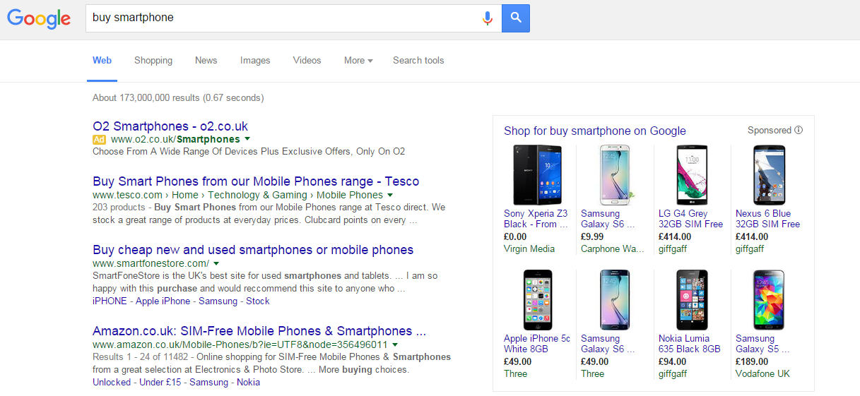
To view O2’s search advert, I had to type into Google search UK, ‘buy smartphone’: The most surprising part of the results page is the lack of competition! However, it becomes clear that most of the competition comes from Google Shopping since when it comes to smartphones, most people will want to see the phone visually as it is easier to describe a phone and potentially show off it’s USPs in image form than in text. However, looking at the search advert, O2 have made a relatively good advert:
- It is packed full with keywords by mentioning ‘smartphone’ twice in the title and URL section of the advert.
- The description is a call to action and finishes by highlighting the factor O2 can offer something nobody else can on the market: ‘exclusive offers’.
I do think the advert is a bit boring and vague, though. But, I can see why they have done this since they want the web user to browse through their range of smartphones upon clicking onto the advert.
After clicking on the advert, I came to the following landing page: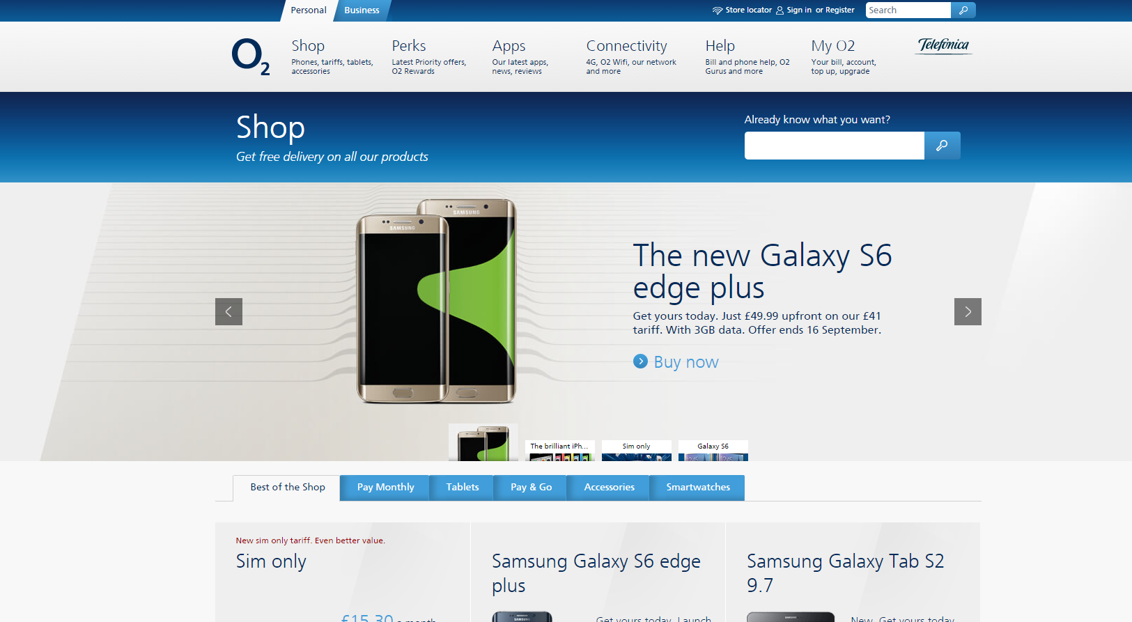 This landing page has many positive points which I will go through below starting from top of the landing page to bottom:
- The navigation menu is too the point, clear and uses hover animations to display more options to the web user, just in case they want to go to another area of the website.
- The next section of the landing page down is for those that know the smartphone they want. This serves as a short cut for web users that have decided what smartphone they want saving them the time and hassle in finding it: this will help decrease the exit and bounce rate of the landing page.
- The main section of the landing page is filled by a beautiful slideshow illustrating the smartphones and plans O2 have on offer.
- The best bit, to me, of this landing page is the bottom part. By making the titles of the mobile phones appear with a hint of what they look like will make many web users enticed enough to scroll down to view the rest of the landing page. Therefore, the content below the fold of this landing page will definitely not go unnoticed.


