The last PPC campaign I analysed in the ‘Analyse A Real PPC Campaign’ series was from Lacoste, who had created a PPC campaign to capitalize on people looking for Boxing Day sales. As great as the targeting and search advert was, there were a few areas of improvements forthe landing page, such as including the color red to make clear of the great sale Lacoste had on.
A typical New Year’s Resolution, for many people, tends to be to lose weight or get fit. Considering such a search phrase, here is an analysis of a PPC campaign from the NHS (National Health Service in the UK).
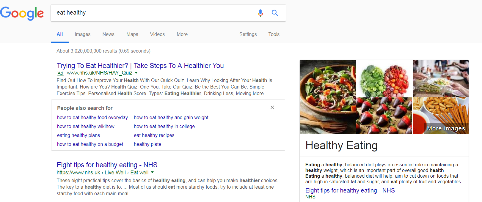
To view NHS’ PPC search advert, I had to type into Google search UK, ‘eat healthy’:
What is interesting about the search results is that it is already dominated by the NHS. Not only is the top organic result the NHS, there is also a rich snippet to the right of the top organic search result. This begs the question why would the NHS even fund such a PPC campaign? Some of the potential reasons include:
- Pushing people to a different landing page than the organic top result
- Promoting a different section of the NHS website, such as the quiz to check if you are healthy or not
With this, the search advert is a good advert, in the sense that the title addresses exactly what the web user searched for. It asks the question which the web user will answer ‘yes’ to, followed by a call to action to induce an action from the web user: a click onto the advert to take the quiz.
After clicking on the above advert, I came to the following landing page: As a landing page goes, there are some good points to this landing page which makes it a good example of a click through landing page:
- The general font size is quite large, making it appear that there is not much content on the website that is hard to read (the smaller the content, the less likely web users are to read it).
- The navigation menu is clear and takes up minimal space.
- The central area of the landing page is taken up with a clickable slideshow, pushing web users into taking the test to see their heart age and health. Asking questions, along with call to actions, are a good way of encouraging web users to complete the action/activity you want them to do.
- If the web user does not click to take the test, the fact that there is content half above/below the fold will make clear to the web user that, if they want to read more about health etc., they can do so by scrolling down the landing page. This is an effective way of having lots of content on a click through landing page, without scaring web users away upon first landing onto it.


You must be logged in to post a commentLogin