The last PPC campaign I analysed in the ‘Analyse A Real PPC Campaign’ series was from Shark Vacuum, who had areas of improvements for both the search advert and the landing page – it was noticeable how cluttered using multiple fonts and text transforms are on a landing page from looking at Shark Vacuum’s PPC landing page.
An extremely popular area on the internet, for online publishers and website owners, is with SEO. There are many companies that offer software/platforms/programmes that enable web users to dive into the realms of SEO, understanding just exactly what is going on with the search engine optimisation of their own site and competitors. Looking into this area, here is an analysis of a PPC campaig from Moz.
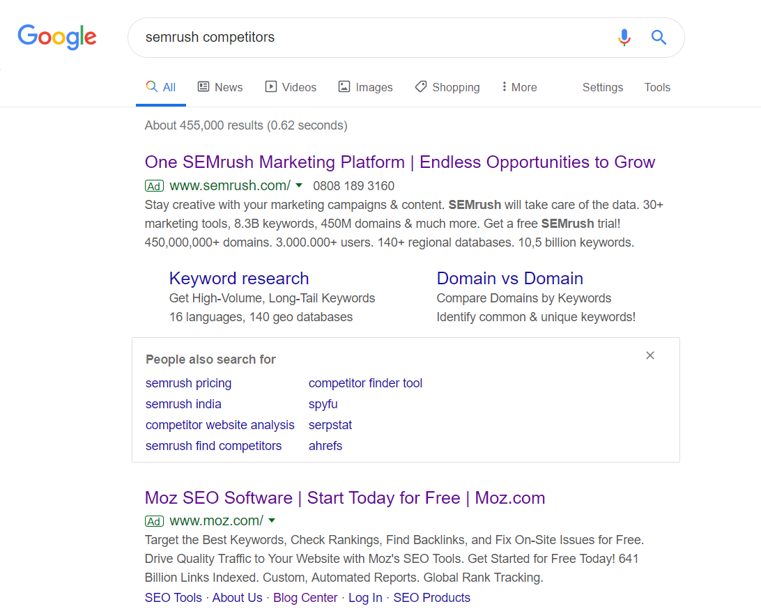
To view Moz’s PPC search advert, I had to type into Google search UK, ‘semrush competitors’: This is an example of Moz trying to take software from the mention of a competitor to them. Their thought process is that if people are searching and, most likely, want to use SEMRush and the competitors to SEMRush, they are probably would want to use Moz. Bidding for SEMRush could be the reason why SEMRush has decided to bid on this too: to ward off the competitor by reclaiming #1 spot on Google search results and gaining back traffic.
With the site links extension being larger with SEMRush’s search advert, and the fact that they are bidding for such a keyword search phrase, it is likely Moz are going to struggle to get a better click through rate than SEMRush. However, the fact Moz have included the power word ‘Free’ might be a potential reason web users will click on their advert over SEMRush – SEMRush does include the mention of a free trial, but only in the content heavy description, where it is likely to be less noticed.
After clicking on the above advert, I came to the following landing page: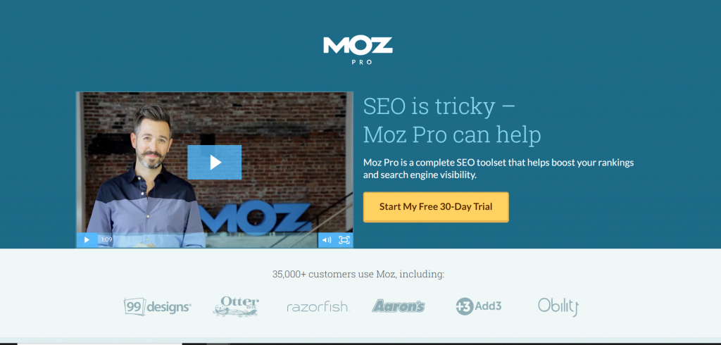 As a landing page goes, this is a great example of a click through page for the following reasons:
- The landing page is clean, with the important content and information in the central area of the page, where it will be engaged with the most.
- Although there are no images on this landing page, the video helps to break the content up, keeping the web users interested in the page.
- The web user should have more confidence with Moz are seeing the reputation they have, of the customers that use their service, as well as having over 35,000 other customers.
- The button for the click through is yellow, clearly differentiating it from the rest of the landing page. With it being the only link above the fold, it increases the likelihood of a click through onto the button (the fact it doesn’t have to compete with anything else).