
The last PPC campaign I analysed int he ‘Analyse A Real PPC Campaign’ series was from Adagio Tea, who had a good search advert and an average landing page, since there were both positives and negatives associated to the page. Continuing the theme of drinks, energy drinks are a huge market that is seemingly dominated by two main players: Red Bull and Monster. With this, here is an analysis of a Monster energy drinks, at least that was what I thought it would have been about…
To view Monster’s PPC search advert, I had to type into Google search UK, ‘monster’: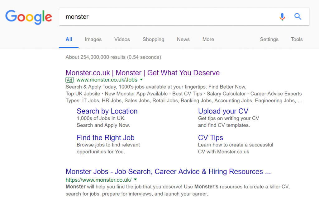 Straight away, it is clear this is not an advert promoting the energy drink brand but a job searching website that is also called Monster. It is not very common for this to happen in PPC, since brand related PPC campaigns usually occur to ward off competition from competing for competitor brand names. Monster energy drink needs to look long and hard at their organic rating, since it is very low, unlike Red Bull, and even Carabao. Monster need a PPC campaign to stop traffic going to the unrelated website.
Anyway, let’s analyse Monster, the job searching website. The advert is very good and contains a lot of detail what Monster do. However, an area that concerns me is the start of the title, considering this is the area most web users are going to read and engage with first. It is generally better to have the domain at the end of the title with the brand name at the start. Other than this, Monster’s search advert is good.
After clicking on the above advert, I came to the following landing page: Now this is a great example of a landing page for the following reasons:
- The whole theme is purple, inline with the theme colour of the brand. Purple was a good choice by Monster as it is commonly associated with being high quality, which Monster hopes the jobs you search for will be.
- The main central area is a search bar for jobs – this is given the main area since it is what Monster wants the web user to do. This is particularly pushed by the image of the Monster pointing towards the web user, putting emphasis to point the web user out to do the lead that is closest to the image of the Monster.
- To continue the emphasis to get the web user to search, the top navigation area is very simple to make sure the attention is kept to the web user searching for a job in a chosen location.
- There is content below the fold of the landing page, displaying popular jobs. However, this is not given attention since Monster wants the web user to search for jobs instead.
Overall, this is a brilliant example of a landing page which has every edge of the page focused around making sure the web user performs the action Monster wants them to do: search for jobs.
You must be logged in to post a commentLogin