The last article in the ‘Analyse A Real PPC Campaign’ looked at AutoTrader who had a keyword packed advert that took web users to a landing page similar to that of Amazon’s. However, what was most revealing from the article was Seat’s campaign who had a faulty landing page and was, therefore, paying to get traffic to see an error page. In this article, I will be looking at an area which has blossomed on the internet: insurance comparison websites.
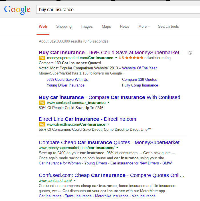
To view a selection of insurance comparison PPC campaigns, I typed into Google search UK ‘buy car insurance’:

What I notice about these PPC adverts is that both MoneySuperMarket and Confused.com are ranked organically number one and two. However, considering there is a PPC advert from another competitor, DirectLine, and Confused.com are organically below MoneySuperMarket and that MoneySuperMarket wants top spot, they have all created campaigns to fight against each other.
The campaign I am going to look into detail at is MoneySuperMarket’s. Their PPC text advert is well designed for the following reasons:
- They have used statistics to make clear how good their service is. When it comes to looking at adverts, web users notice numbers extremely easily. Both Confused.com’s and DirectLine’s have percetanges in their descriptions of 50% and 55%. MoneySuperMarket has put their statistic into the title to give it that bit more publicity and no matter what the percentage is representing, ‘96% could save…’ sounds a whole lot better than ‘50%’ or ‘55% could save’.
- They have gained the web user’s trust with their description that they were ‘Voted ‘Most Popular Comparison Website’ 2013’.
Therefore, from just a number and a short description, MoneySuperMarket have confirmed to the web users that they are the best insurance comparison website out there which will work wonders in gaining them a high CTR.
After clicking on the advert, I came to the following landing page:

The first thing I notice about the landing page is that MoneySuperMarket is one of the best comparison website for insurance out there. Confused.com claimed in their advert that 50% of people could save £246 with them. However, MoneySuperMarket are now confirming 51% can save £243. Therefore, if the web user had any doubt about using MoneySuperMarket to compare insurance, that should be washed away after seeing this last statistic and the other statistics listed to the left hand side.
Looking at the layout of the landing page, it is clear that it is a click through page. The two largest buttons on the page are ‘Get New Quote’ and ‘Retrieve Quote’. This makes clear that, above anything, MoneySuperMarket wants the PPC traffic to click on either of these two button.
This brings a landing page optimisation tip forward that to encourage a web user into gaining you a conversion, prioritise everything that is on the page. After you have done this, make sure that the highest prioritised elements are made the biggest on the landing page and the less so prioritised things are made smaller. This will result in the web user looking at the highest prioritised things first and less so prioritised things second.


