Continuing my series in ‘Analyse A Real PPC Campaign’ where the last PPC campaign I analysed was the Google Chromebook, today, I will be looking at the technology industry again with the giants themselves: Microsoft. An important point to remember is that different campaigns should have different levels of ‘technology’ or ‘internet whiz’ in them depending on the type of traffic they are looking to get. For example, a PPC campaign on gardening will target not very ‘tech-hungry’ people and the landing page and text advert should bare this in mind. On the other hand, businesses such as Microsoft should be looking to add much more technology in their campaign because the type of people that are interested in Microsoft will be interested in the internet and general tech too. For this reason, it will be interesting when analysing Microsoft – will their landing page be tech-filled or will they have gone for simplicity instead?
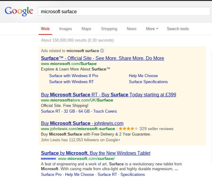
To see Microsoft’s PPC text advert appear on Google search results, I types in the keywords ‘Microsoft Surface’:
As you can see, Microsoft are the highest bidders for their own keywords with John Lewis being second. This mimics what Google did with their Chromebook. Both companies would rather inform and share information about their new products with the world before they look to buy it from shops such as John Lewis. This is because both products have only just been released and need a PR boost.
With there being two adverts for the same keywords from Microsoft, I am going to choose the top advert to visit the landing page. But, before that, let’s analyse the text advert:
- The heading is longer than normal for a text advert which means the description can become alot shorter.
- In the advert, Microsoft are very general and offer lots of incentives , ‘See more. Share more. Do more’. We are left with ourselves asking lots of questions about what that means. We are intrigued by this new product.
- There is no URL but for links to different sections of the website. Microsoft just wants web users to explore the Surface website.
After clicking on the advert, I came to this landing page:
The first thing I notice about this landing page is that it is colourful. This gives the impression that the product can be easily personalised – a trait many people want in gadgets. In essence, it is a pretty simple and effective design with not many links to click on except for the small menu at the top. It’s almost as if Microsoft has taken tips on how to make a landing page from Apple. Instead of forcing the web user to click on many links to find out more information, they have made it possible to store all the information on one page and for the web user to see more information about the tablet, all they have to do is scroll down. There’s a good tip for infomercial landing pages. Don’t force web users to click on links because it will take time for the page to load and it’s also more effort and slower than scrolling. Therefore, keep all the information on one page in a clean style like Microsoft have done.
Is there landing page effective? I would say so yes. They have put their tablet on par with the iPad by making their landing page look colourful, personalised and filled with information at the scroll of a finger. Good job Microsoft.


stu
April 4, 2013 at 8:49 am
Good analysis Will. One thing I think may be too strong of an assumption is that Microsoft is the highest bidder. They most likely do not have to pay the most to rank the highest for a branded term. They probably have a QS of 10/10. Ranking number 1 does not mean you are paying the most.
Will Green
April 8, 2013 at 10:07 am
That is a good point and it was probably wrong to give the stereotype that to gain top you need the highest CPC. The quality score will affect it too which, as you say, has probably helped Microsoft gain #1 potentially on a lower CPC.