
The last PPC campaign I analysed in the ‘Analyse A Real PPC Campaign’ series was from The Gym Group, who had a very good search advert and click through landing page. The only improvement was with the actual button that The Gym Group wanted PPC web users to click onto: it could have been larger and brighter, which would have increased the CTR of it.
An area that is always going to be in high demand is with buying software to run on people’s computers. One of the most used software packages comes from Microsoft, in the form of the Office Suite. In this article, we are going to look to analyse a PPC campaign targeting one of the Office Suite, Excel.
To view Microsoft’s PPC search advert, I had to type into Google search UK, ‘buy excel’: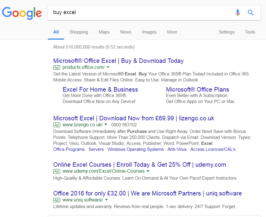 Unsurprisingly, the maximum of four adverts appear for this search phrase, highlighting the fierce competition there is, not from competitors but other websites wanting to profit from selling Excel software or courses on Excel. With this, Microsoft have done very well to rank at the top of paid search results:
- Considering Excel is their own software, it would look bad if they didn’t rank #1 for paid search results
- Other people selling Excel wouldn’t make Microsoft as large a profit margin than if the web user bought direct, hence why they could most likely afford a higher CPC.
- Although Lizengo below Microsoft used the site link extension, Microsoft’s site link extension fills much more space. This helps to differentiate the advert from competition, increasing the click through rate.
- Microsoft have been clever by using the copyright (R) symbol in the title. This adds authenticity that it is Microsoft that you will be clicking onto. For many web users, this will encourage them to click on the Microsoft advert over others (since people would rather buy directly from the supplier than from a third party).
After clicking on the above advert, I came to the following landing page: After a promising and good search advert, this campaign is let down a little by this landing page. Here are the main points associated to it:
- It is good that Microsoft have buttons to buy different packages of Excel. However there is no mention of what the features are different between the different packages, making it difficult for the web user to understand which one best suits their needs.
- The main area of the landing page is completely wasted by being blank. Reasons to buy Excel, or a positive image of someone using Excel for business, home use or as a student would have worked much better than leaving it blank. It feels as though the landing page only half finished loading with the look it has.
- There are no enticements to get the web user to buy Excel: just the options of what they can buy. Although enticements are not necessarily needed if the web user searched ‘buy excel’, they could have made the more expensive packages more attractive and advertised what they would get on top of the basic Excel package people buy.
You must be logged in to post a commentLogin