The last PPC campaign I analysed in the ‘Analyse A Real PPC Campaign’ series was from Microsoft, promoting the latest and greatest Windows 10 laptops. What was found was that Microsoft chose to create a PPC advert to ensure web users saw the latest and greatest Windows 10 laptops, as well as to promote their products, being the Surface range of laptops and tablets.
With Christmas seemingly around the corner, now is the time of year that people look to go on Christmas outings with friends, colleagues and family – a typical favorite of people’s is to enjoy stand up comedy at a comedy store. With this, here is an analysis of a PPC campaign from Joanna Lumley.
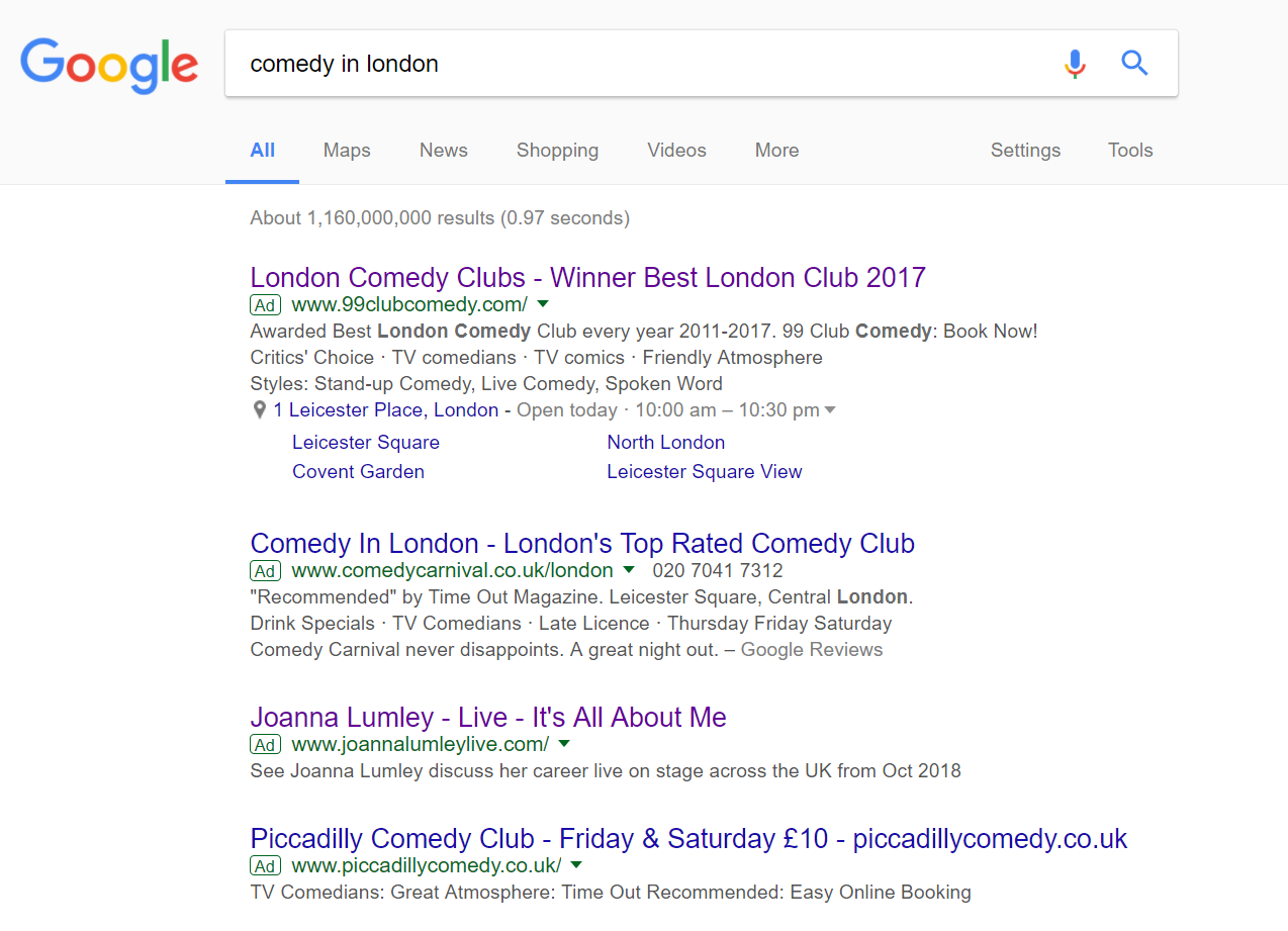
To view Joanna Lumley’s PPC search advert, I had to type into Google search UK, ‘comedy in london’: The competition for such a search phrase is high, with a maximum of four adverts appearing in paid search results. With the conversion being the purchase of one or multiple tickets, each valued £10+ upwards, it is possible that the CPC of this search phrase is high too.
Looking at Joanna Lumley’s advert, it is extremely basic which would not work to her advantage. She is doing stand up comedy in London, hence the PPC search advert. However, there are problems with her search advert, listed below:
- For one, she does not use any ad extensions, which makes her advert come across as quite bland and content-light.
- The title is a bit of a shambles – All it contains is her name and title of her stand up show. There is no call to action or anything else that suggests it is worth clicking onto.
- The description does not evoke any sense of entertainment enticement to the web user. The call to action to ‘See’ is not a strong enough call to action to get a click. With the advert so content-light already, it would have been a good idea to make the description a bit longer to compensate.
- With such a specific stand up show, it would have been very useful to have used an ad extension or mentioned in the description a review of her stand up show, to make clear to the web user it is funny and good value.
After clicking on the above advert, I came to the following landing page: This landing page is extremely simple, with a minimalist approach to push the attention onto the image of Joanna.
However, before seeing the content of the landing page, a pop-up appears. The problem is that the pop-up displays, near on enough, exactly the same information as to what is on the landing page once the pop up is closed. The idea behind a pop up is to expand and draw the attention of the web user to some sort of information which is significantly important that the web user should digest: not to repeat information already on the landing page. For this reason, this is not the best of examples of a landing page, and the same can be said for the search advert too.


You must be logged in to post a commentLogin