It has been a while since I have done an ‘Analyse A Real PPC Campaign’ article with the last looking at Sainsbury’s Christmas advert based on the war – it was interesting how the landing page was a YouTube.com video and, to be fair, with the conversion being to watch the video, worked well. It’s that time of year where shoppers are getting eager and excited for the types of deals retailers do for Black Friday. I always get the idea that Black Friday is a bit too frantic: especially with the videos of some of the shoppers sprinting through stores trampling over others to get their hands on Pikachu doll that’s at 20% discount!
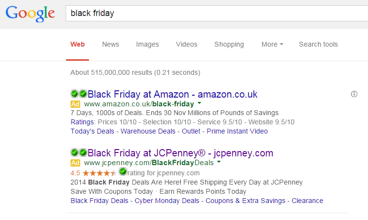
The campaign that is going to be analysed will be by JCPenney. To view their advert, I had to type into Google search UK, ‘black friday’: It’s clear that ‘black friday’ is a popular keyword phrase many web users will search at this moment since Amazon has an advert for Black Friday too. It’s great that they have bid for ‘black friday’ because I always get the impression that most people don’t know what deals are actually happening at what stores on Black Friday. So, to conquer this problem, JSPenney are advertising what deals they have for Black Friday through PPC.
- Their advert is ram packed with ad extensions, namely the site links and review extensions.
- The advert is also ram packed with call to actions. This is a great strategy since Black Friday is a hectic and urgent time of shopping. So the more call to actions in the advert, the more urgency the advert will perceive to the web user.
After clicking on the following advert, I came to the following landing page: What JCPenney have done here is create a pop up message to update the web user on some things new about their site. The only problem with this pop up, though, is that it just looks un-professional. When it comes to website design, never have a variation in colours sizes, italics and bold for your text because it will make the text look generally un-professional.
After clicking removing the pop up message, here is the landing page: After the poor pop up message, I can say safely the landing is much better for the following reasons:
- The red colour theme is perfect for Black Friday. Red is the colour of danger and injects a sense of urgency to people.
- There is a navigation bar at the top to let web users go to just about any part of the website easily and quickly.
- The Black Friday deals are done in what seems like an infographic. As well as enticing the web user to scroll down the page to continue the Black Friday infographic, it also displays the information in a super clear format for the web user to digest.


