The last PPC campaign I analysed in the ‘Analyse A Real PPC Campaign’ series was looking at Amazon Headphones, who had a standard ‘Amazon style’ search advert that navigated web users to the category page of Amazon for headphones . In this case, it was the familiarity of the search advert and landing page to organic search results that worked well for Amazon.
An area of growing popularity is in electric scooters, with many cities now making regulations for people to use them as their daily commutes. With this, here is an analysis of a PPC campaign from iScootCo.
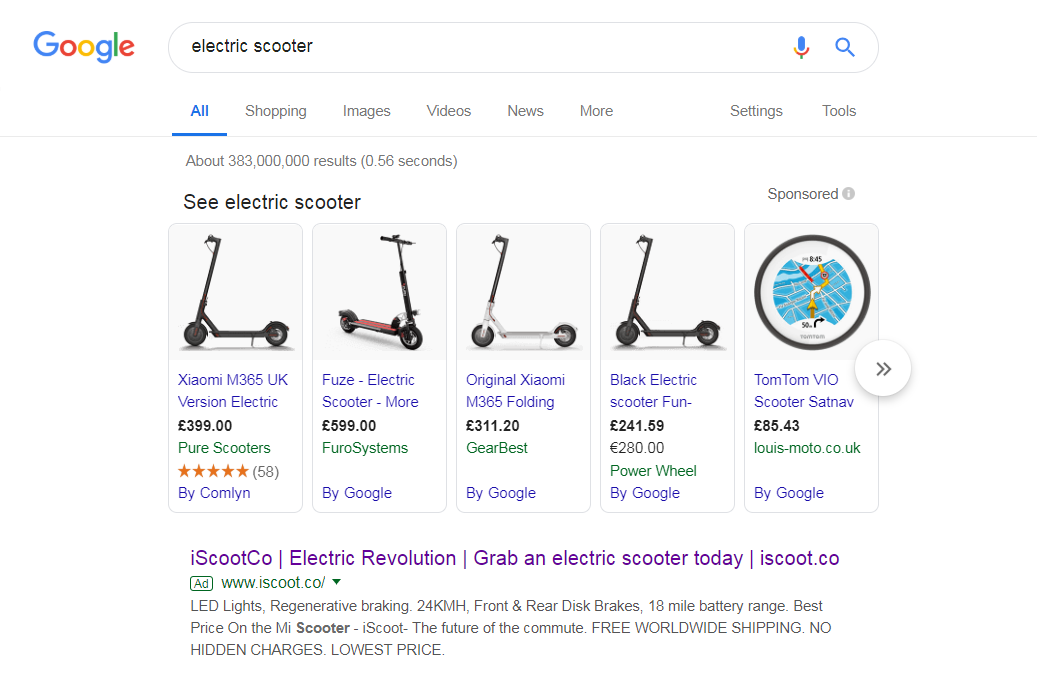
To view iScootCo’s PPC search advert, I had to type into Google search UK, ‘electric scooter’: Even though the popularity of these scooters has risen dramatically, there is still only one traditional advert appearing, with Google Sponsored shopping results above it. This makes it difficult for iScootCo to compete, when they cannot show an image, so will have to compete some other way.
It is also clear why iScootCo have a search advert at all. The organic ranking of the website appears nowhere for this search phrase. For that matter, it doesn’t even appear for when you type ‘iScootCo’ in! This makes clear the company is very new: so new that Google are still indexing the homepage of the website.
Looking at the advert itself, it has a very effective title, which is full of keywords and a call to action in the middle. The problem for this advert consists of a very cluttered description, which is difficult to digest, especially when iScootCo use capitals to try and gain the web user’s attention half way through.
After clicking on the above advert, I came to the following landing page: Looking at the structure and design of this landing page, it is not too bad. It is a product page which displays all of the key information for the web user to decide whether to buy the electric scooter or not. This includes:
- An image of the product
- Pricing
- Information of the product below the image
- Reviews
- Choices to choose on the left (such as color)
The main problem with this landing page, though, is that the sizing of the page means it is difficult to view all of the necessary information easily. It looks very bad to have a part image of the product you are trying to advertise and sell, and makes life for the web user harder in order to see the image and comprehend whether they want to buy it or not. Without doubt, this will affect the time on site, bounce rate and conversion rate of the landing page. It is important to remember that web users judge landing pages as soon as they land onto them, so it is important to impress them!
You must be logged in to post a commentLogin