
The last PPC campaign to be analysed in the ‘Analyse A Real PPC Campaign’ was Debenhams who had, generally, a well thought out and optimised PPC text advert and landing page which many advertisers could gain beneficial points to help them with their own campaigns. It’s the first ‘Analyse A Real PPC Campaign article of the year so let’s kick it off with a start! For this article, I will be analysing the food industry that is Hello Fresh’s PPC campaign.
To view Hello Fresh’s PPC search advert, I had to type into Google search UK, ‘buy food’: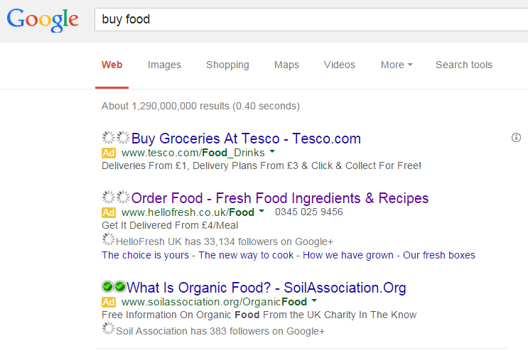 With Hello Fresh not even ranking on the first page of search engine results, there is a clear incentive to why they wanted to create a PPC campaign for these crucial keywords. From looking at the advert, here are the main focus points to draw out from it:
- Hello Fresh have used two ad extensions being the site link extension and the Google+ extension. This will do two things for the advert 1) help the web user gain confidence in clicking on the advert since Hello Fresh have over 33,000 follows and 2) give the web user the option to explore different areas of Hello Fresh’s website without even having to go through the landing page first (cutting out the middle man and saving the web user some time).
- There are two call to actions in the advert: one in the title and one in the description. For the best adverts with the highest CTR, you will find they will adopt this structure for CTAs.
- Hello Fresh have included a phone number in the advert so web users can contact Hello Fresh through other means other than the internet. For some people, this is the preferable option.
From the above points, it is clear that this advert is a good advert. The only downside, I feel, is that the title and description could have a little more information to entice the web user further since a lot of space is being wasted in the description.
After clicking on the above advert, I came to the following landing page: Straight away, there are many points I like to mention to explain just why this is a great landing page (and these points you can use too in your landing pages):
- The landing page mentions a coupon added at the top in green. As well as green representing life (and fresh), the fact that a coupon has been added will make the web user feel they will be getting a good offer and for a limited amount of time too. This will inherently increase conversions.
- It is clear from the large orange box that this is a click through landing page. With a click through page, a lot of attention needs to be placed onto the box that wants to be clicked on (which Hello Fresh have done by making it a bold colour and increasing the font size of the text inside the box).
- The picture replicates someone who has purchased from Hello Fresh, which will make web users want to use their service too.
- Due to the lack of information on the search advert and landing page, the web user will naturally want to click on the orange box to find out more, whether they want to use Hello Fresh or not.


