As Google Adsense increases in age, more and more people will find more combinations to adverts which produce more successful results. Some colours, ad sizes and types encourage clicks while others just turn people off the advert. Gaining the right combination  can make you some serious money as a publisher. The problem is getting the ‘right combination’. By this, I mean the right combination between colour, ad sizes, ad placement and possibly ad types too. If you are going to read this post and not follow some of the tips below, stop reading now because this article won’t benefit you at all. However, if you want to take away some advice that will work forever within Adsense, put yourself in the shoes of your readers. From doing that, you will understand better how they react to your adverts.
Ad Colour
Different colours represent different things. There is the obvious and go for a blend, contrast or compliment colour set-up like I state in my Adsense tips. However, others colours mean different things which may benefit you. The colour blue is the stereotypical colour for links on the internet. For this reason, you might want to make the title of your adverts blue to make your readers aware that these adverts are linked and can be clicked. Other colours such as purple represent wealth (you wouldn’t have thought it!) and the rule of thumb goes that people will want things more if they are worth more. The best thing to do with your adverts is to experiment. Experimenting helps find the best combination for your adverts.
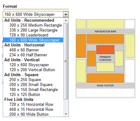
Ad Sizes
This a little trickier to choose. Google suggest that the recommended ad sizes are 300×250, 336×280, 728×90 and 160×600 aka all the biggest ad units. This makes me suspicious considering that Google have recommended users to pick the biggest sized adverts because they will most likely earn Google the most. Nowadays, I find a lot of people, like myself on Ask Will Online, saying that the most successful ad sizes are the squarer units. Banners and skyscrapers don’t get as high a CTR as the squarer units which is why I use them myself. Remember that Google only allow 3 ad units per web page. Therefore, don’t waste your ad units on something that isn’t likely to get you clicks!
Ad Placement
Again, Google have helped us out displaying a heat map which shows where adverts should go. They say the adverts are better suited to the left sidebar than right sidebar and above the content. Personally, I find that the header advert to the right of the website’s logo and above and below the content are the most successful ad spots. Readers come to a website to read the content, if they see an advert first, because they are in the mood of reading the content, they will read the advert and hopefully click on it. But, again, it is all about experimentation. Learn your website’s success spots for adverts.
What I tend to do when it comes to experimenting is try out a different combination of ad colour, placement and size once a week. When I’m happy (after around 8 weeks of experimenting) that I have the right combination, I leave it and let the clicks roll in. Remember, if you have visitors that constantly come back to your site, you don’t want to annoy them by placing adverts of different sizes, colours and placement every week, do you?


