The last PPC campaign I analysed in the ‘Analyse A Real PPC Campaign’ series was from Coca Cola, who had bid for their own brand name in order to display information different from the top organic result, pushing people to a landing page surrounding information about Coca Cola as a brand.
With the summer months creeping up, now is a potential time that customers look to purchase tickets at theme parks, such as Universal Studios. With this, here is an analysis of a PPC campaign from FloridaTix.
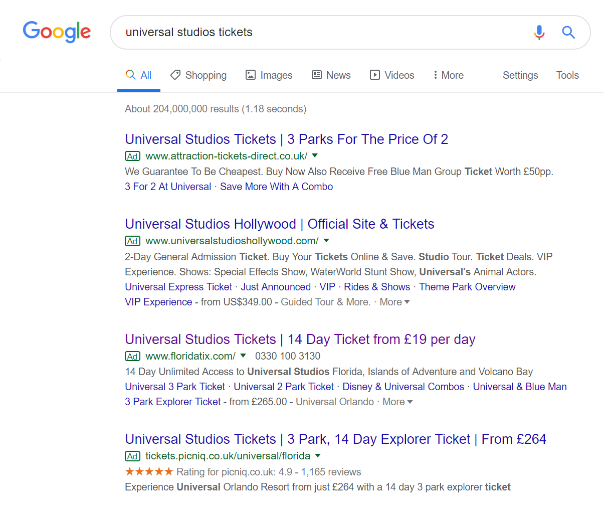
To view FloridaTix’s PPC search advert, I had to type into Google search UK, ‘universal studios tickets’: The maximum number of adverts appear for this search phrase, at four. In terms of ranking, FloridaTix are 3rd, suggesting their ad rank/CPC is not as high as the above two competitors.
However, looking at the advert, it has many good points associated to it:
- If you are going to quantify anything, especially regarding cost, you are going to want to make sure it is displaying better (cheaper) information than competitors, which is exactly what FloridaTix tries to make out like it does. For example, picniq displays a 14 day ticket at £264, whilst FloridaTix displays the same ticket as £19/day. Automatically, most web users will think FloridaTix is cheaper. However, £19/day works out as £266/14 days.
- It is important to have the search phrase in the title of the search advert, which is why all four have done exactly this. The web user wants to know that they are going to be purchasing the right tickets for the right theme park, for whatever advert they choose to do this with.
- FloridaTix has used the site link extension to expand the links the web user can click onto – this will help to increase the CTR of the advert.
After clicking on the above advert, I came to the following landing page: As a landing page goes, this is an example of a product/service page. This is because to get a conversion to take place, the web user needs to buy the tickets on this website. But, in order to do this, they need to gain information about why they should buy the ticket first. Taking this into consideration, this is a very good landing page for the following reasons:
- The landing page is colorful, which goes with the culture of the theme park being family friendly and exciting.
- The central area of the page is filled with images of the main attractions of the theme park, helping to entice web users into wanting to visit the park more.
- There is lots of information on this landing page, in an easy to read format. For this reason, the bounce/exit rate will be kept low.
- In order to be able to purchase tickets, the web user will need to scroll below the fold of the page. This will display the different tickets they can purchase, again, in a colorful and easy to read format.


