The ‘Analyse A Real PPC Campaign‘ has been a great success in the sense that is enables advertisers of PPC to see how real life campaigns are run, illustrating the good and bad points associated with them through analysing them. This makes it clear that analysing real life campaigns not only will help you gain information on how the big companies use PPC, but also make you aware of mistakes some PPC campaigns make too so you can be sure it does not affect your campaign.
For this reason, I thought it would be a great idea to simply analyse a selection of landing pages, highlighting the main pros and cons to each one.
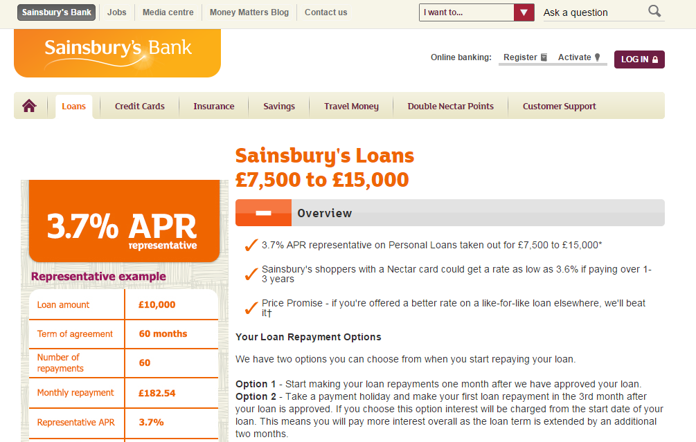
Sainsbury’s
- A clearly structured landing page with information of a navigation menu and one sidebar to the left of the content.
- Sainsbury’s use bullet points with the rule of three to persuade the web user over to a conversion.
- However, there is a lot of content on this page which might affect the exit rate of this page.
- This is a click through landing page. The fact the button to be clicked on is below the fold of the page will cause the CTR of this page to decrease.
Ford
- The page uses a dynamic slideshow of animated pictures to show off the range of cars Ford have. Using images and animations will always grab the web users attention in landing pages.
- The navigation menu by Ford is very small so that the majority of the space is kept to images.
- However, there is a lot of choice for the web user in the sense that there are tens of links to potentially click on. The landing page is vague in its objectives through PPC.
Money4YourMotors
- Like with Sainbury’s, Money4YourMotors have used the rule of three (but, in this case, rule of four) bullet pointed to win the web user over.
- The page is simple and has not much content so it doesn’t give the web user the potential to lose interest quickly.
- However, the logo design lets this landing page down as it looks cheap and unnecessarily colourful.
- The slogan looks even cheaper made, which begs the question how a company can produce such a cheap looking logo and slogan.
BuyMobiles
- The ‘SALE’ sign is in red to inject a sense of urgency into getting the web user to buy from the sale. Synergy-like results will be produced with the addition of the countdown clock.
- The whole design of the landing page is clean and encourages the web user to scroll down the page, showing different mobile contract options, which is what BuyMobiles wants.
- However, no figures are displayed regarding pricing for any mobile phones or contracts above the fold, implying that they are not something to brag about.
- The time it took to load this landing page was slightly longer than the others. A long loading time will play with the short attention span of web users making them want to find an alternative and quicker-to-load website.


