The last post in the ‘Analyse A Real PPC Campaign’ analysed Airfix who appeared to have campaign that was vague in its objectives since Airfix were organically ranked number one. As well as this, I looked into examples of good and bad landing pages that advertisers can take note of when creating their own landing pages. In this article, I am going to be looking into the deodorant market which enabled me to view a campaign by Dove.
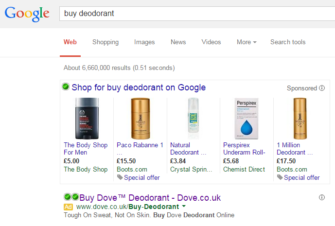
To view Dove’s PPC campaign, I had to type into Google search UK, ‘buy deodorant’: Straight away, it is interesting that Dove is the only actual search advert to be displayed for such a key search phrase. It is interesting to say that the above sponsored links look more into the price base of deodorant rather than the brand so Dove are not trying to win web users over through price-beating: they are trying to win over web users with the unique selling points Dove’s deodorant will bring to the web user. We need to remember that once a web user or person is hooked to a certain brand of deodorant, they will theoretically be buying that same product for the rest of their life. Therefore, it is vital to the success of Dove to win over as many people as possible to using their product since it is based on many repeat buys.
Looking at the advert itself, it is simple and to the point. For web users, this is exactly what they want to hear – deodorant has a purpose and, from the search advert, Dove is addressing that. Sometimes, simplistic adverts work best in PPC…
As well as that, the fact Dove have used two call to actions (one in the title and one in the description) will work great at enticing the web user into a click. Overall, it is a well designed search advert that will naturally get a high CTR. As we know, the CTR will affect the campaign’s quality score which will make the whole cost of the campaign decrease.
After clicking on the above advert, I came to the following landing page: This is a great example of a well designed landing page for some of the following reasons:
- The page has the white theme which is exactly what the web user will want since white has the image of being a very clean colour. There is also a nice hint of blue to compliment the page with Dove’s logo colour.
- The page is all about letting the web user explore the range of products Dove have which is made possible through the moving slideshow and useful navigation menu at the top.
- The arrow in the bottom left is not part of the landing page. I put it in there to highlight the fact that the top of one of Dove’s products can be seen above the fold. The fact Dove has done this will encourage web users to scroll down the page, enabling them to view a wide range of Dove products. This is a very clever from Dove since without the top of that product, there would be no real incentive to scroll down the page.


