The last article to be analysed in the ‘Analyse A Real PPC Campaign’ series was Alfa Romeo, the Italian car manufacturer. What we found was that the search advert was well optimised but specified very quickly on just one of the many cars Alfa Romeo sell. There were also a few areas of improvement the landing page could have had. In this article, with many families looking towards the start of the summer holidays, I thought I would look at a campaign where dreams come true (cheesy , I know). Anyway, let’s have a look at Disney’s PPC campaign.
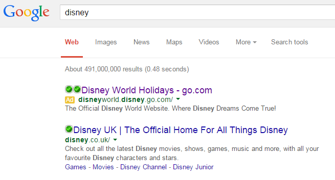
To view Disney’s PPC search advert, I had to type into Google search UK, ‘disney’: Like with most companies, Disney made a campaign for their own brand name. The main reason for this is to direct web users from the homepage but to the landing page of the PPC campaign, which looks at Disney holidays instead of Disney in general. Just from this, Disney have done a good job in trying to profit more from people searching for Disney.
The advert is packed full of keywords and is relatively short. They can be vague here so that the web user has to click to find more about what Disney World has to offer. It was interesting the URL Disney decided to put in the title, ‘go.com’. After typing it in and hitting the enter bar, it turns out go.com is a Disney URL so that explains why that is there.
The only thing two things I would say about this website is that 1) I think it needs a call to action and 2) the URl is very long and complicated which is not really necessary for the advert as it clutters it a bit.
After clicking on the above advert, I came to the following landing page: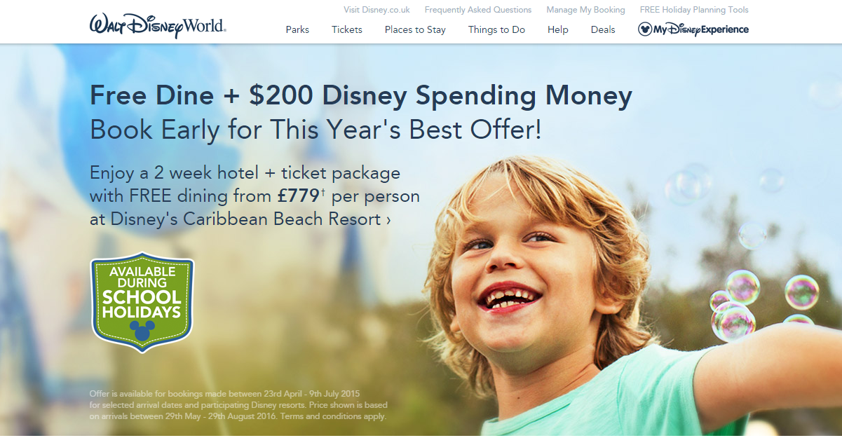 There are both good points and bad points to this landing page which I will highlight below:
- Images are great for landing pages. The large image of the happy child really sends home the whole message of dreams coming true encouraging web users greatly to book a holiday to Disney World.
- The navigation menu at the top will help the web user explore just exactly what Disney has to offer on a holiday.
- However, I am slightly disappointed Disney made a mistake with currencies, displaying both dollars and pounds to traffic from the UK, this is a silly mistake to make.
- The page needs a sign or something to entice the web user to scroll down the page since a lot of this landing page appears below the fold. However, there is nothing that would make me scroll down since it simply look like a click through landing page.
- If it was a click through landing page, the button to click on is very vague since only a certain part of the image is linked – another poor mistake by Disney.


