
First things first, happy new year! I wish everyone the best success this year with whatever road you take and enjoy the year thoroughly! To start off the new year, this article will be an analysis of a PPC campaign. The last article in the ‘Analyse A Real PPC Campaign’ series looked at Haig Club who had a very clean PPC campaign in general but inherited a problem on their landing page due to having age restricting content on it. In this article, I will be looking into a campaign capitalising on the January sales: Debenhams.
To view Debenhams PPC search advert, I had to type into Google search UK, ‘sales’: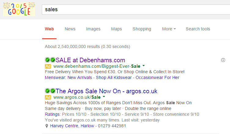 Straight away, the first thing to point out is how general the search phrase/word is. ‘sales’ in January will always bring a stiff amount of competition so it is no surprise that the CPC for ‘sales’ will be higher than normal.
Looking at the advert itself, it is well optimised for the following reasons:
- The title has SALE in caps lock. This helps to attract the advert some more attention so that web users see Debenhams’ advert before competitors.
- The description is a well constructed call to action highlighting what the web user can capitalise from in the Debenhams sale.
- Debenhams chose to change the URL in the advert to something that will increase the CTR of the advert ‘/Biggest-Ever-Sale’.
After clicking on the above advert, I came onto the following landing page: From just looking at the landing page, it is clear this is a click through landing page. There are many links the web user can choose that will direct them to a different area of Debenhams’ website. This makes it clear that the objective of this page is to get the web user to click onto any of the links and explore into Debenhams: preferably the sale.
All in all, Debenham’s landing page is a well designed landing page for the following reasons:
- They have prioritised the text by changing the font and size of it – it is clear Debenhams want the web user to read the text in the pink box first since it is the largest font on the page.
- The choice in colours used on the landing page are somewhat interesting. Pink is generally quite a feminine colour which implies that the sale is more for women than men. The baby blue banner also compliments the pink nicely.
- Like with most of the landing pages I have analysed, Debenhams has a great navigation menu at the top so that the web user can visit any area of Debenhams’ website they should so please. This means that if the web user wasn’t interested in the sale but another part of Debenhams’ website, they can still get access to it from this landing page.


