The last PPC campaign I analysed in the ‘Analyse A Real PPC Campaign’ was blackcircles.com who had a very good PPC campaign in general: both the search advert and landing page was well optimized in many different ways. For this article, I will be looking into the comparison market – it seems that the comparison market for things such as car insurance, home insurance and so on has emerged out of nowhere over the last ten years. Needless to say, it is a market for which can be very profitable. Hence we should see stiff competition in PPC. The campaign I am going to be analysing is from Compare The Market (comparethemarket.com):
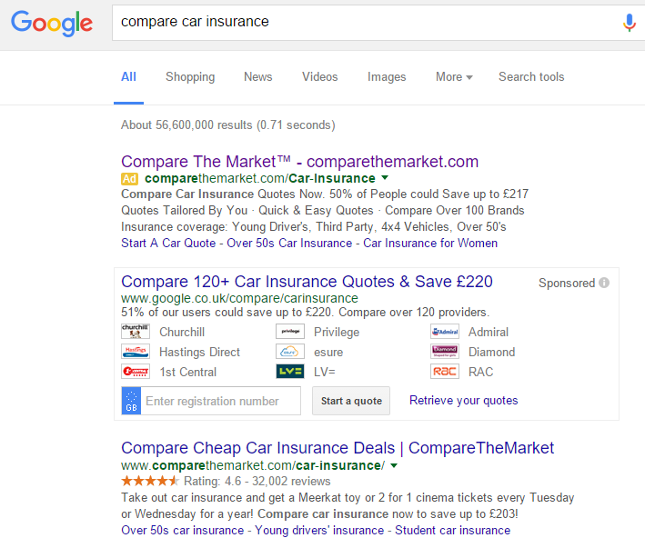
To view Compare The Market’s PPC search advert, I had to type into Google search UK, ‘compare car insurance’:
Looking at the advert itself, the title is great. Since the brand name includes keywords, Compare The Market can afford to make the title just their brand name and URL so that:
- Web users know how to directly visit their site
- It is encrusted into web user what Compare The Market is – comparing the market!
I’ll be honest, I am disappointed with the rest of the advert. It feels as if they have gone into far too much information for a PPC search advert description: to the point that it is quite boring to read. Maybe part of Compare The Market’s approach was to include as many lines after the title as possible to try and increase the area of space the advert would take up, making it seem larger and further away from the other adverts? Either way, I feel it is not doing the advert any favors in general.
After clicking on the above advert, I came to the following landing page:
- Images are the way to go: especially as backgrounds. They make the whole landing page more vibrant and expressive which words and content struggle to do.
- It is simple in design with plain white text covering the main area (which is where Compare The Market want web users to look first). After that, two clear green buttons signify that this is a click through landing page.
- The navigation menu is brilliant. It covers lots of information by having a scroll down and takes up minimal space on the page.
All in all, a poor search advert that was recovered by a great landing page.


