The last PPC campaign I analysed in the ‘Analyse A Real PPC Campaign’ was from Moz, who had, on the whole, a great PPC campaign, not surprisingly either. Considering that Moz offer a SEO service, it shouldn’t come as a shock that they create a well designed PPC campaign.
An area that is going to be interesting to see a PPC campaign for would be with purchasing train tickets. Already we have looked at thetrainline and how they use PPC to benefit from customers buying tickets. In this article, we are going to look at a competitor. With this, here is an analysis of a PPC campaign from Avanti.
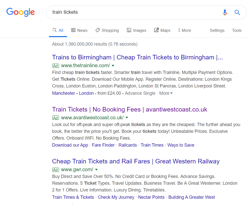
To view Avanti’s PPC search advert, I had to type into Google search UK, ‘train tickets’: Avanti don’t actually rank on the first page of search engine results for such a crucial keyword, so it is quite clear why they have decided to target this keyword search phrase in PPC. It’s interesting that Avanti did not have a higher CPC to gain the top spot of PPC, with thetrainline taking it instead. Considering thetrainline rank #1 organically, it appears they are trying to go for a #1 spot strategy for both PPC and organically.
Looking at Avanti’s advert, the search advert title follows a standard structure in PPC of keywords – incentive – URL. The only improvement would have been to make the keywords a call to action, such as ‘Buy Train Tickets’ instead of ‘Train Tickets’.
The description, at least, contains incentives and call to actions to get the web user to click onto the advert. The site links extension is a good extension to use. However, they need to be something that web users could potentially click onto. If somebody searches for train tickets, they are extremely likely to buy train tickets – it could be seen that the site link extensions could have been better by having common fares, a bit like what thetrainline have done.
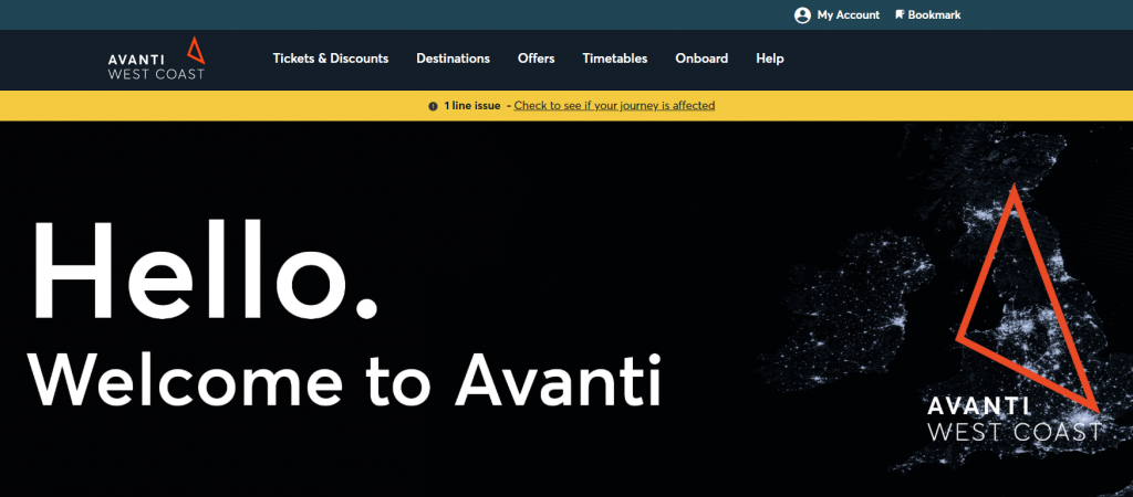
After clicking on the above advert, I came to the following landing page: As a landing page goes, in terms of looks, it is nice looking and attractive to land onto. However, in terms of conversions, this landing page is seriously flawed.
From just landing onto the page, it is not obvious what the conversion is – the page appears to be a welcome page, that’s all. It’s only when you scroll below the fold that a lead capture appears to enable customers to choose two locations to get prices for train tickets and times.
If Avanti really wanted to improve the performance of this page, it would make complete sense to stick the lead capture above the fold and remove the welcome message. A/B testing would indicate this improvement.


