
It is widely known from the news that asos.com is a thriving business that is becoming quite profitable. Why? The answer is simple. ASOS make it easy and cheap to buy designer clothes online. For this reason, I thought it would be a good idea to analyse their take on the PPC campaign. Last in the ‘Analyse A Real PPC Campaign’ series looked at Sony Entertainment who had a well designed landing page from the user of what colours Sony chose to put where on the landing page.
To view ASOS’s PPC campaign, I typed in ‘summer clothes’ into Google search UK: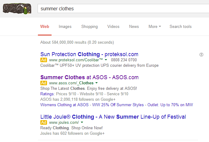
Firstly, it is clear why ASOS has made a PPC campaign with the inclusion of such a keyword phrase:
- ASOS are organically ranked #3. However, this is for summer dresses for women. Therefore, it is harder for them to promote the whole range of their clothes organically (as well as the fact that they are not #1 organically).
- ‘summer clothes’ is a very popular keyword phrase since many people at around this time of year will start to buy summer clothing. Therefore, ASOS need to prepare an advertising campaign to capitalise upon this income of traffic.
Looking at the advert itself, ASOS have decided to include the keyword ‘summer’ into every element of the text advert. This reinforces what type of clothing ASOS are selling making the advert seem more relevant to the web user’s needs. They have also decided to be very general with their advert which only mentions that they have summer clothing. The reason behind this is so that this advert attracts every type of web user looking for summer clothing (remember that fashion is vague at best). They have included a call to action in the description being ‘Shop The Latest Clothes’ which will help in improving their CTR.
The ratings are from a Google Consumer Survey and with them all being 9/10, it will help to entice web users into clicking on the advert.
After clicking on the above advert, I came to the following landing page: The first thing made apparent from this landing page is the large sized font at the bottom. It is clear ASOS wants the web user to read this first since it is the largest font on the landing page and in bold (remember, choosing what size font will help you guide the web user into what they should read first and last). They have a unique selling point that they have next day delivery if you order by 10pm, which is actually quite impressive…
Apart from the black background notice about deliveries (which you can close), the landing page guides the web user either onto the men’s or women’s sections of the website. ASOS don’t need to change their landing page that much to that of their main page since they want the web user to browse through their website’s range of clothing and it will only reduce conversions if the theme of the website/landing page differs from each other.


