The last PPC campaign I analysed in the ‘Analyse A Real PPC Campaign’ series was from Aqua Card, who had a search advert that could have been improved in a few areas to make it stand out from the competition, especially since it ranked lowest in paid search results. Recovering from this, the landing page was a really good example of how a click through landing page should look.
With Black Friday and Cyber Monday around the corner, a common product that is typically discounted is the television. Looking to buy a TV, here is an analysis of a PPC campaign from AO.
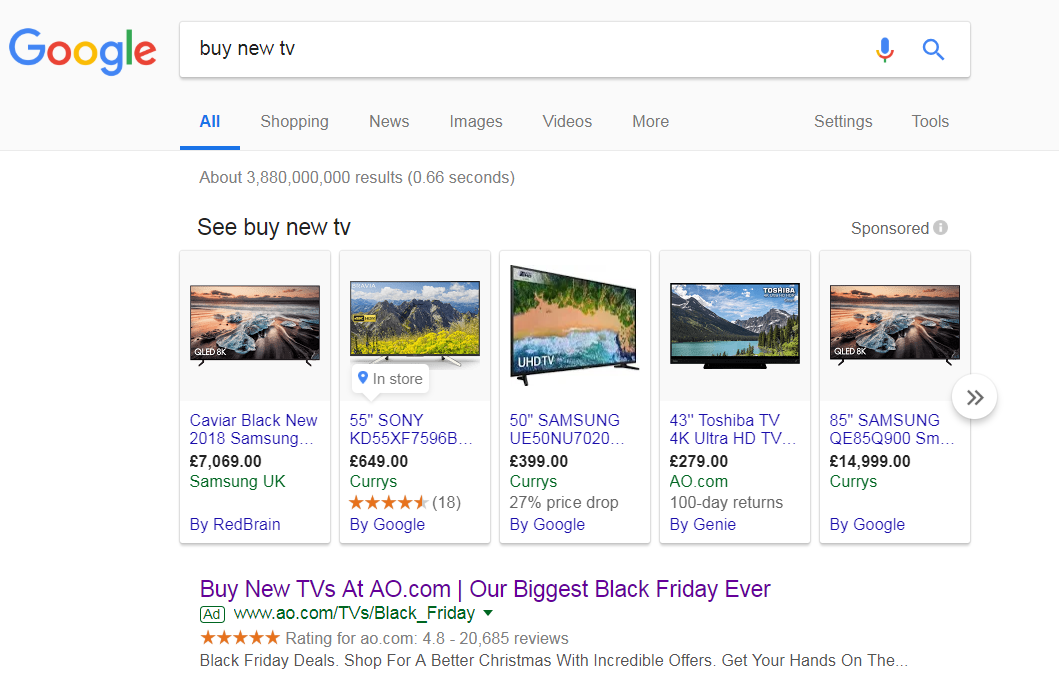
To view AO’s PPC search advert, I had to type into Google search UK, ‘buy new tv’:
When this occurs, it is a good idea to add a little extra to an advert, with more content, ad extensions and call to actions. AO have used the ratings extension which definitely improves the advert. They have also addressed Black Friday, which will help the CTR massively – the advert is up to date and relates to something that is happening now.
After clicking on the above advert, I came to the following landing page:
- There is a lot of content – the majority of PPC traffic that clicked on the advert will want to see TVs for sale, or a range of categories for TVs so they can narrow their search. This makes it clear that, for this landing page, only the blue lined box for the Samsung TV and the ‘Type’ filter products to the left are the only things that the web user will look at and show an interest in.
- I like the fact there is a banner for Black Friday TV deals with AO. However, it is confusing messages that they have not put more promotion into Black Friday. If their deals were amazing, I would expect this whole page to be Black Friday themed, and not just a banner advert that points web users to another page of TVs. As a simple fix, the page that the banner advert links to would make a better landing page than the current one.
- Saying this, the fact there is only one TV shown above the fold and the website is designed in a shopping results style, it encourages the web user to scroll below the fold of the page. This introduces them to the numerous TVs AO offer, with pricing and information for each.


