Continuing the ‘Analyse A Real PPC Campaign’ series, the last I looked at was Chiltern Fireplaces who were a small local business that had a well designed search advert but, unfortunately, a poorly designed landing page which I saw a few areas they could have improved on. In this article, instead of analysing a whole PPC campaign, I am going to look at the search adverts that pop-up on Google search UK for ‘switch bank’. As you can imagine, this search term has stiff competition which will provide some interesting search adverts to analyse.
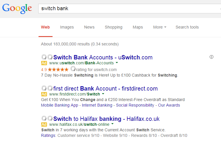
To view a range of adverts about switching bank, I had to type into Google search UK, ‘switch bank’: As you can see, we have three adverts so that means three adverts to analyse (excuse the loading signs in the picture).
uSwitch
The first advert is about a comparison website that wants you to use their service when switching from one bank to another. Below are the main points I saw in this advert:
- uSwitch have the seller rating extension in their advert which shows their online rating out of five stars to the web user. It is a good idea for them to use this since their seller rating is quite high at 4.9 stars out of five. This will help the web user build confidence for using them.
- uSwitch included their URL in the title which is always going to help them for numerous reasons.
- Figures are used in the description to entice the web user further (numbers are good at doing this).
- There is no call to action so no direct action the advertiser wants the web user to do.
First Direct
This advert is from an actual bank that has the objective of tempting existing bank holders over to switching to First Direct. The main points for this advert are:
- Just like with uSwitch, they have the URL in the title which is a good optimisation technique for promoting direct traffic.
- The description sounds more appealing than uSwitch because it is not ‘up to £100’ the web user will get but ‘Get £100’.
- First Direct have used site link extensions to enable the web user to click onto different areas of their website. Not only this, they have been clever with the site links they have used. The last site link, ‘Our Awards’, makes it clear that First Direct must be a good bank to use.
- Again, like uSwitch, no call to action.
Halifax
Halifax, like First Direct, is a bank which also has the objective of encouraging web users to switch to their own banking service. The main points for their advert are:
- They have included the URL in their title like the other adverts. However, they have also included a call to action in the title too, ‘Switch to Halifax Banking’. This will work dividends in increasing the CTR.
- They have used the ad extension of consumer rating extension to show what people think of Halifax. Of course, the reviews are high which will entice the web user into using their bank.
- There is no financial incentive like there are for the other two adverts – this may turn web users away from clicking on the advert.
Ultimately, uSwitch has, what I deem to be, the best advert. They have the top position for paid search results and the highest keyword phrase density for what the web user was searching. These two alone will provide a large boost in hand to gaining the best and most amount of traffic through PPC.


