The last article to be analysed in the ‘Analyse A Real PPC Campaign’ series was Triumph Lingerie who, I felt, had a major problem with their campaign: the keyword they bid for: Triumph. The majority of people that will be searching for Triumph will expect the Motorcycle company and not a lingerie company on Google search results! Anyway, here is a campaign that has bid for its own brand name correctly with this being Airfix.
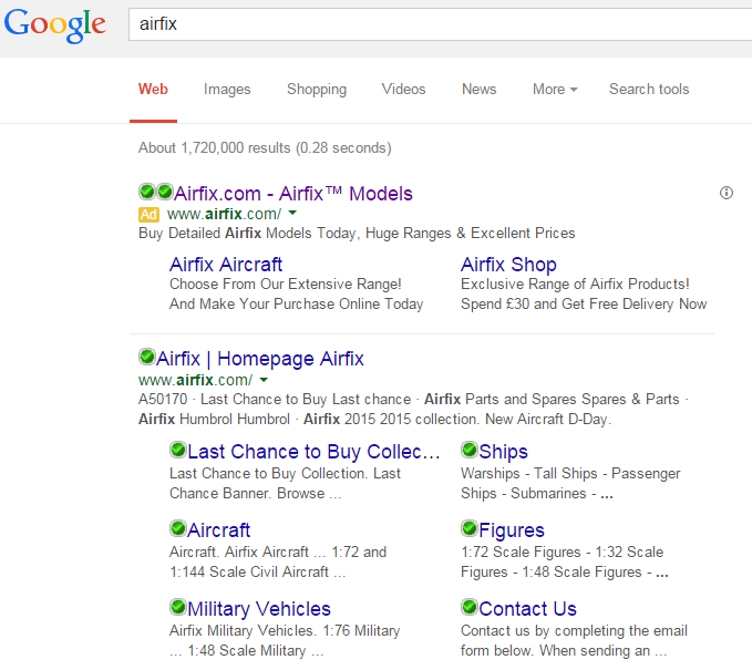
To view Airfix’s PPC search advert, I had to type into Google search UK, ‘airfix’: Straight away, it is a bit of a confusion to why Airfix have bid for their own brand name. This is because:
- Airfix are already organically number one on Google search results for it. Therefore, they are not creating a campaign to gain top spot on search results.
- The organic search result for Airfix has site link extensions coming off of it. So, Airfix did not really need to make a PPC campaign to add site link extensions when they are already present.
- The advert directs the traffic to Airfix’s homepage. This means that they did not create the campaign to direct traffic other than onto the homepage.
From analysing the advert, below are some of the potential reasons why Airfix made a campaign for their own brand name:
- To promote a message – Airfix can do what they want with the description to promote their range.
- To use different site link extensions – The advert’s site links extensions are different URLs to the ones displayed in organic search results. This makes it clear they wanted to advertise these extra pages.
- To promote the brand – The search advert is completely packed with Airfix the brand name. This makes clear that failing everything else, at least Airfix will be getting their brand name strongly promoted with this advert.
After clicking on the above advert, I came to the following landing page: There are a few things I can point out about this campaign that are listed below:
- The landing page is very red. Now, considering the Airfix logo is red, this is not a surprised. However, it is clear that Airfix have used this colour more to inject a sense of urgency into the web user. This is because the area that is in red is the ‘Last Chance To Buy Collection’ so there needs to be some urgency to get this stock sold.
- The navigation menu at the to of the landing page is effective in letting the web user move to whatever area of the website they want to. A good navigation menu will help reduce the bounce and exit rate of landing pages.
- Images with a low amount of content are key to keeping a web user on a landing page. This is evident from the well designed landing page by Airfix.


