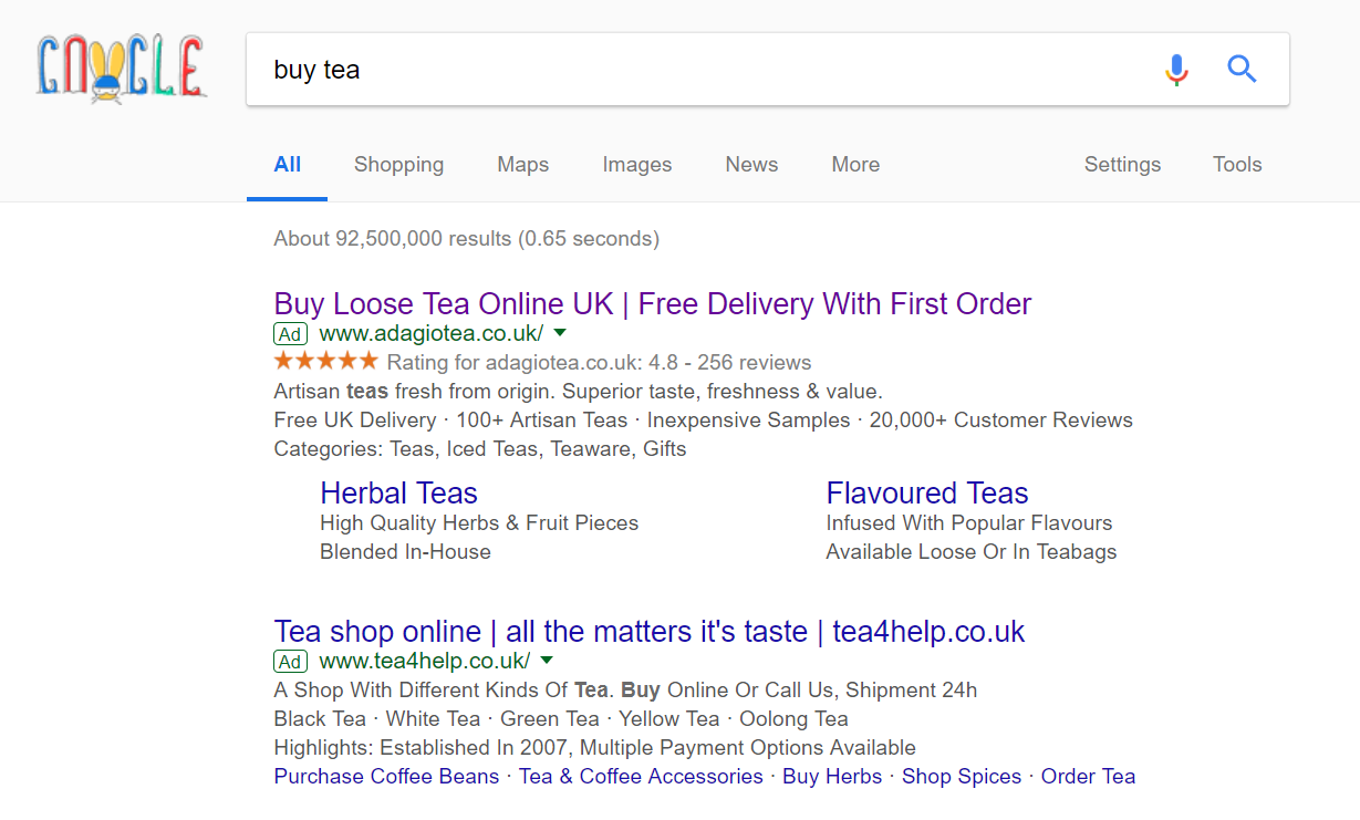
The last PPC campaign I analysed in the ‘Analyse A Real PPC Campaign’ series was from Everest, who had a search advert filled with call to actions and a well optimized lead capture landing page, making the overall campaign, on the whole, very good.
For the United Kingdom (as I cannot state this for other countries), we are quite made on boiling the kettle and having cups of tea multiple times a day – it is a large market to take advantage of. For this reason, here is an analysis of a PPC campaign looking to attract web users into buying tea: Adagio Tea.
To view Adagio’s PPC search advert, I had to type into Google search UK, ‘buy tea’: For this search phrase, the competition does not appear to be fierce with only two adverts appearing. Looking at Adagio Tea’s advert, it is very ‘clickable’ due to the ad extensions used, expanding the size and colour of the advert, providing it more exposure and links to click onto. The title is effective since it starts with a call to action and ends with a financial incentive. Following this, there is the use of the ratings ad extension, which Adagio Tea have used since they have a lot of ratings, with them all averaging very high – this helps to build confidence to buy products from them.
The description is then used to provide more information as to the types of teas that Adagio Tea sell, whilst the site link extension enables the web user to accurately go to the type of tea they want to, if the web user already knows such information. Overall, this is an excellent search advert.
After clicking on the above advert, I came to the following landing page: The first impressions of this landing page do not appear too good. There is a lot going on, even though there seems to be a lot of empty space, which will discourage web users from shopping with them. For the vast majority of tea lovers, all they want is standard English breakfast black tea (since this is the most sold form of team in the UK). Therefore, it may have been better to put emphasis on English black tea on the landing page instead. Even with this, there are positives to this landing page, as well as negatives:
- Having a discount about Chinese teas is effective in drawing attention.
- The navigation menu hovers upon expansion, showing images of each type of tea too.
- The way the tea is pictured is very effective in giving an idea as to the type of tea that corresponds to the name, as well as providing a sense of quality to the tea.
- However, there is not enough on this landing page that makes me want to purchase tea with Adagio tea.
- There is a lack of any prices for the tea, which is slightly worrying (since this usually means it could be very expensive) – this will put some people straight off.
- Far too much space has been used to promote the red discounted Chinese tea.
- Below the fold are images of the best sellers – it would have been better to have displayed such teas above the fold since best sellers are likely to produce high conversion rates for such a landing page from PPC traffic.


You must be logged in to post a commentLogin