The last PPC campaign I analysed in the ‘Analyse A Real PPC Campaign’ was from Kenwood Travel, who had good search advert and a good landing page, except for the bland colour scheme used on it (which needed to be more colourful to reflect the type of holiday they were promoting).
An interesting product that has gained a lot of attention this year has been the fidget spinner. Although the patent for a spinning toy similar to a fidiget spinner halted in 2005, it has only been 2017 when the market flooded to produce these toys that are seemingly addictive to fidget with. With this, here is an analysis of a PPC campaign targeting fidget spinner buyers: AB Toyz and More.
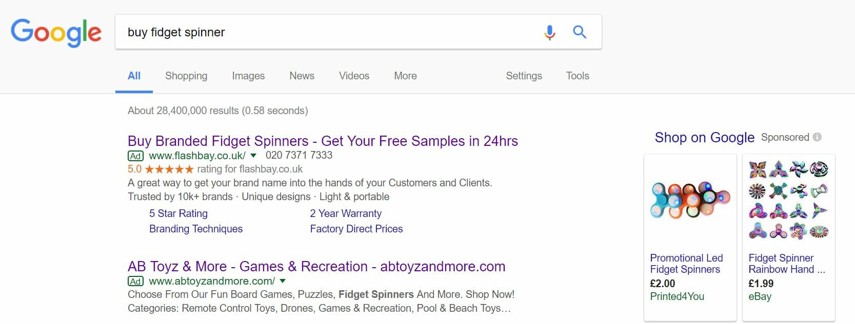
To view AB Toyz and More’s PPC search advert, I had to type into Google search UK, ‘buy fidget spinner’: Straight away, it is evident that Google sponsored shopping results seems to work better than PPC adverts, since only two of the maximum of four adverts appear for this search term whilst many Google shopping results appear (with six in total).
Looking at AB Toyz and More search advert, it is slightly too vaguely targeted for my liking. The advert above theirs from Flash Bay is a better example of how the search advert should look – target fidget spinners so have an advert solely about fidget spinners.
However, what AB Toyz and More have done is make a general promotional advert for the whole of their website, with fidget spinners only mentioned once in the search advert. From first impressions, this will struggle to achieve a good CTR as opposed to the likes of Flash Bay’s advert.
After clicking on the above advert, I came to the following landing page: I have not said this much in this series, but this is truly a poor landing page for this PPC campaign.
If I was to forget the poor targeting of this campaign for fidget spinners and just looked at this as a landing page for toys etc., it lacks a lot of crucial elements to a PPC landing page:
- Effective navigation menu to browse the website. There are a few links to the top that seem quite specialist. This website would benefit, greatly, from a hover scroll down navigation menu with many more links, so that the web user has access to any part of the website through the menu.
- The theme is very bland and boring, which it really should not be for a toy shop. You only have to look at the likes of Hamleys to gain an idea of what it should look like.
- The two products in the central area of the landing page are not the best images to have used as example of fun toys etc.
Then we come onto the contextuality of this landing page, which does not even feature a fidget spinner anywhere! For this reason, this is one of the worst landing pages and campaigns, as a whole, analysed in this series.


