Banner ads may be simple to deal with and implement from a technical point of view, but they are not so easy to actually design. In fact, entire courses are devoted around the idea of learning how to design good banner advertisements. The reason why it’s so important to create good banner ads is because you want the advertisement to actually attract and hold attention and then take the person from the ad to your site smoothly and with no bumpy surprises.
In order to learn how to create a good banner design, it’s educational to look at what a bad banner ad looks like. The following things are generally attributed to bad banner ads and so they are things you should avoid. By the end, you may learn that it’s actually fairly easy to avoid bad banner ads and so you’ll start to wonder how anyone can have this problem!
The Wrong Models
Using people in your banner ads is a good idea because real people tend to react well to picture people. Photos of people invoke a sense of wanting to be just like them and bingo! You have a potential conversion. However, the wrong people on your ads can cause a fair amount of grief.
Models with:
- Poor expressions (scowling, cranky, angry)
- Vivid expressions (vivid eyes, exotic appearance)
- Bright colors which clash with the rest of the advertisement
Can all put a hamper on your banner ad and make it harder to attract and keep attention so that people will go to your website.
WHOA! Definitely not a banner ad you want affiliated with you! Ignoring the eye placement, the model is terrifying! I don’t think any insurance broker really wants their company affiliated with someone scary.
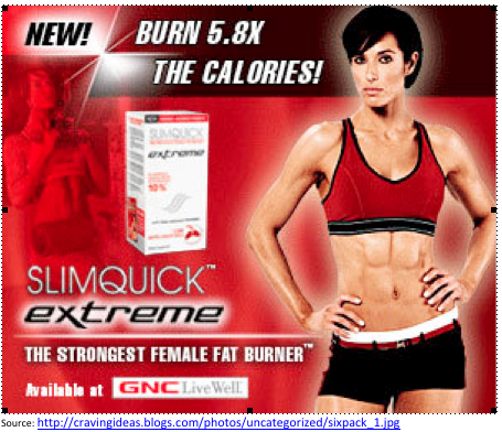
Getting Better! The model’s body points towards the product and the product is framed by her and the faded model on the other side.
While putting a picture of a person in your advertisement can be very helpful, you should always make sure to grab the right models and put them in the right positions and expressions or you could end up doing more damage than good.
A simple way to turn a bad model good is to change the direction she’s looking. Instead of having your model look at the camera, have her look to the side and then place your product to that same side so that she’s looking at the product. That way, your traffic’s eyes are drawn to her eyes and then follow her glance to your product!
A Demand to Action
No, not a call to action, a demand to action! The most common example of this is to put Buy Now on your advertisement instead of something like ‘Learn More’ or ‘Come See’.
A demand to action (ie., BUY NOW) is either lost in the clutter of your banner ad or it puts people off by making them feel pressured. This just leads to you being ignored. Instead of demanding attention with a Buy Now button, try some different wording that will do the same thing but without making the web browser feel as though he or she is being put under the gun.
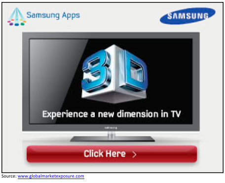
An enticement to action on the other hand sparks someone’s curiosity. ‘Learn More’ intrigues people and makes them wonder what else you have to offer on your page, thus making them click on your ad and go to your website. Things like ‘click here’ and ‘See more’ are also common ways to entice customers to arrive on your landing page and hopefully create a sale for you.
This ad is a lot more enticing than something demanding that you buy something they’ve never heard of before.
A Bad Landing Page
The final part of the ‘Go Away Customers’ brew that poor banner ads can concoct is a bad landing page! Landing pages can often fall victim to poor design. They are easy to clutter, often have different and divergent information (or the information is simply presented in a poor manner) and sometimes there are sudden changes in design. (Those models in your banner ad suddenly disappear or your color scheme suddenly changes). These things are extremely off putting to a customer on a subliminal level and it’s more likely that they will move somewhere else.
A good landing page will take a reader from the banner ad and naturally take them to a page that expounds on what the reader learned in the banner advertisement, not suddenly bombard them with new information. For this reason, many experts advise having a landing page which is tied directly to your banner ad instead of a general landing page that is cluttered and disparate.
Wrap-Up
If you want to condense this blog into a few thoughts, take these things away:
- Your models should be there to make people look at your product or ad, not to take all the attention away
- You should never push to buy now, but entice a customer to want to learn more.
- Make sure your landing page and banner ad is consistent in design, items, and information.
Often, making your banner ads actually work for you is a simple matter of getting rid of the clutter and making sure any models shift their eyes away from the camera and towards your call to action or item you’re selling. Simple tweaks like that are often enough to make your banner ads pop and turn out stronger conversions for you and your website.Author Bio –
Chinmoy works with BannerWeaver.com – a professional web banner design shop for all your custom banner design needs, specializes in designing flash banners, specifically, AdWords banner campaigns in Google’s Display network.


