The last PPC campaign I analysed in the ‘Analyse A Real PPC Campaign’ was from Relate, who had a good PPC search advert, although the ranking was a little low at 3rd. The landing page also had both good and bad points associated to it.
An area that has strong demand and lots of interest in is the electric car market: it is an emerging market where car manufacturers can gain a sizable chunk of market share in, if they get in quick and beat the competition. With this, here is an analysis of a PPC campaign from Renault.
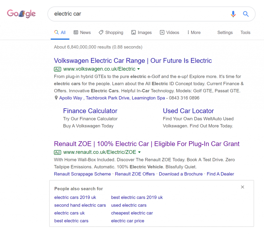
To view Renault’s PPC search advert, I had to type into Google search UK, ‘electric car’:
- The ‘People also search for’ snippet pushes the third advert below the fold, which will heavily impact the CTR the advert achieves
- The top result is a rich snippet from Wikipedia
- Below the rich snippet is a ‘People also ask’ snippet, pushing the top of the traditional organic results even further below
Ultimately, the high density of snippets doesn’t play to the favor of low ranking paid search results, making it even more important to rank above the snippets, just like Renault and Volkswagen have managed to do.
After clicking on the above advert, I came to the following landing page:
- The full range of electric vehicles Renault offers are displayed above the fold surrounded by an electricity-inspired blue line. This is a good way to show web users what options, in a quick manner, they have for buying electric cars with Renault.
- Navigation menus are generally very good for car manufacturers, as they know they need to make sure:
- The web user can explore all areas of the website from the navigation menu
- The menu expands on hovering, allowing it to display lots of information
- The menu is compact in design, allowing more room to be taken up by the image of the electric cars
- The message displayed above the fold of ‘Electrify July’ is a clean and clear message, meaning the majority of web users will have their attentions averted to their area.
- However, the problem is that this landing page is a little outdated – July was around 2 months ago, which might put a few web users off, even if the message is still applicable. It is extremely important to remember that PPC campaigns are live – they need continuous updating, if needs be. Even a simple change of the month, to reflect the current month the landing page is being shown in, could be enough to increase the conversion rate higher than before.


