The last PPC campaign I analysed in the ‘Analyse A Real PPC Campaign’ series was from Disneyland Paris, who had a well designed search advert, that took advantage of the site link extensions, as well as a fluid-designed landing page, that used a video background to illustrate a new feature at the theme park.
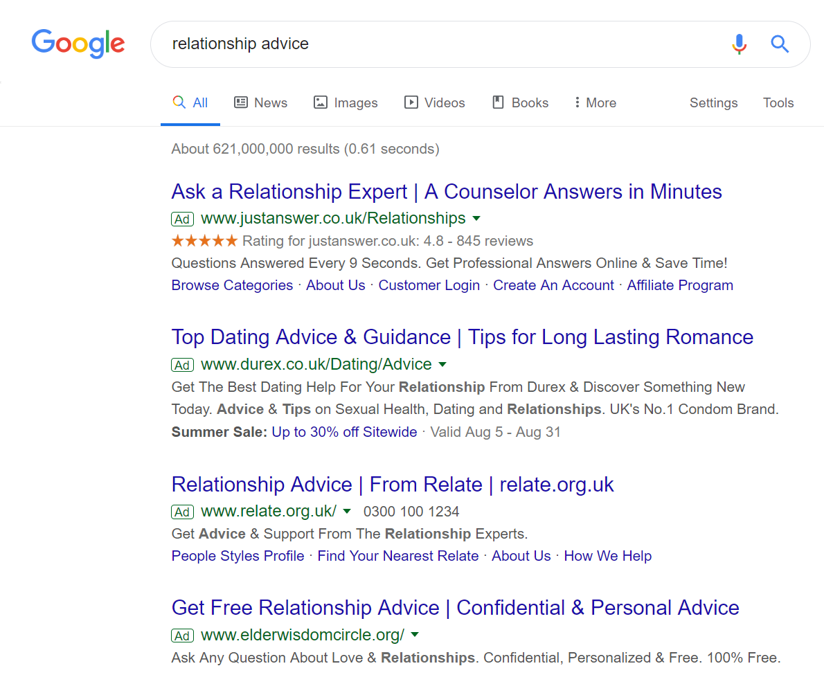
An area that is going to get lots of attention online is with advice, especially relating to relationship advice. Although people like to talk about their relationships with family and friends, many people still resort to gaining advice on relationships online. Looking at this, here is an analysis of a PPC campaign from Relate.
To view Relate’s PPC search advert, I had to type into Google search UK, ‘relationship advice’: The maximum of four adverts appear for this search phrase, making clear that there is lots of competition for this. For Relate, they are ranking 3rd, which would suggest that either their quality score is low or the CPC they are adopting cannot compete against the adverts above them.
Looking at the advert itself, it is very good, for the simple fact the title is clear, to the point, containing the search phrase, as well as the brand name. The addition of a number, as well as a ‘Find Your Nearest Relate’ expands the advert from being just something you can click on online to a person to talk to or visit – for relationship advice, this could be quite important for some web users.
After clicking on the above advert, I came to the following landing page: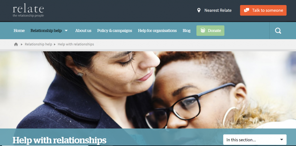 As a landing page goes, this has both good and bad points, listed below:
- It’s not very clear what this landing page is specifically. It could be a infomercial or a product/service page. However, there is no incentive above the fold to find more information out.
- The main central image is strong in the message it is portraying. However, without text, it can be difficult to understand the context of what Relate are trying to portray.
- There is lots of information about the fold, which aims to help people with their relationships. This should be more clearer labelled, either by having some of the content appear above the fold, or an arrow to make clear to the web user that there is content below the fold.
- The design and colour of the landing page is a little bland, using very conservative colours. This does not make the landing page stand out, once the web user lands onto it.
- By having the navigation menu effectively on a separate line to the ‘logo line’, there is a lot of unused space to the right of the logo, which could be used. Wasting space like above the fold of a landing page will not help to improve the performance of this landing page.