The last PPC campaign I analysed in the ‘Analyse A Real PPC Campaign’ series was from Darwin Forest, who had created a PPC campaign to compete against their main competitor: Center Parcs. By doing this, they would be taking contextual traffic away from Center Parcs, which would hopefully see Darwin Forest as a good alternative. After clicking onto the landing page, it was clear they had a good PPC campaign, on the whole, with an effective lead capture landing page.
One area that has lots of interest, especially online, is with electrical products, such as earphones. Looking into this market, here is an analysis of a PPC campaign from Bose.
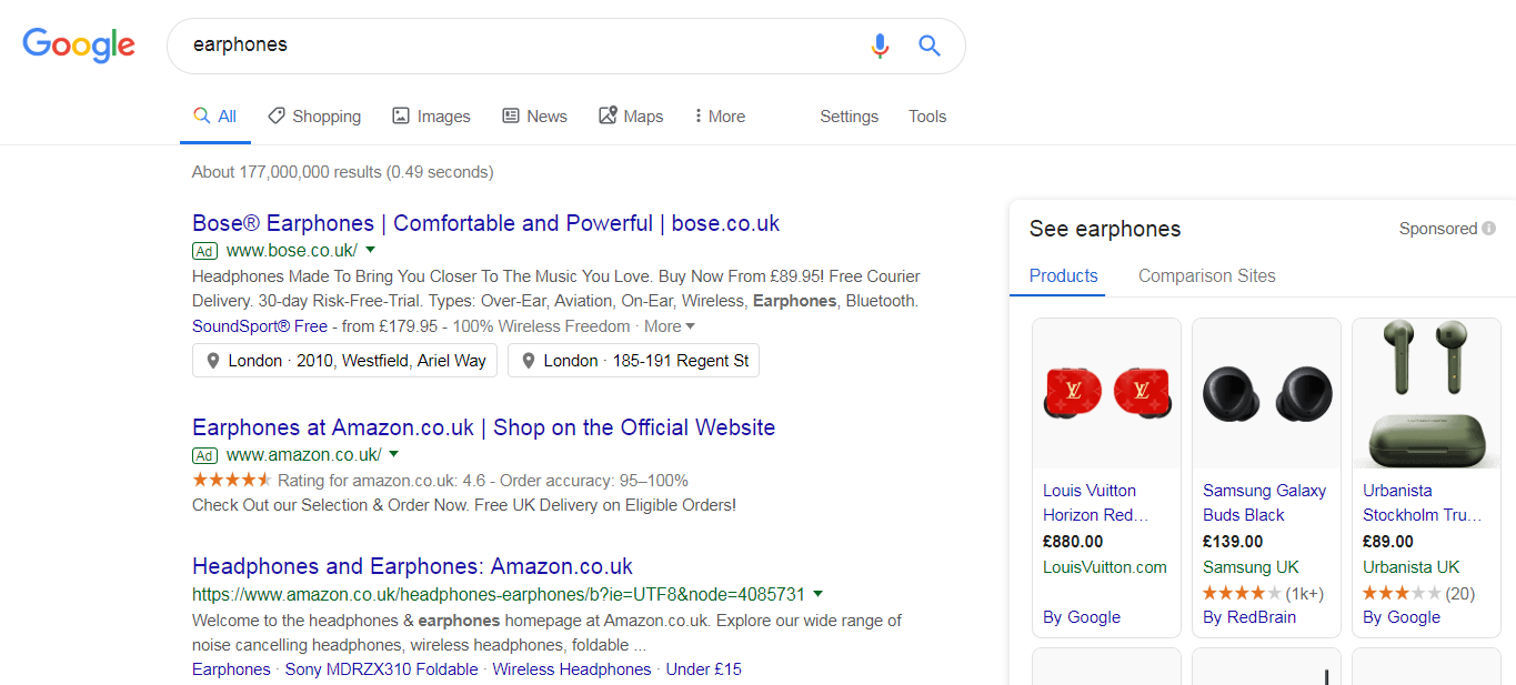
To view Bose’s PPC search advert, I had to type into Google search UK, ‘earphones’:
Looking at the advert itself, it has some effective elements that helps to make it stand out in paid search results:
- Bose have chosen to use the copyright symbol next to their name – this evokes confidence to the web user, that the PPC search advert will point them to the official Bose website.
- Bose have an effective search title, by using words that are good to associate with earphones, such as ‘Comfortable’ and ‘Powerful’. They also added the domain name in the title to encourage direct traffic.
- Ad extensions are used, which help to increase the size of the advert, as well as making it appear more appealing than the basic advert from Amazon.
- Most people won’t want to buy expensive earphones without trying them – this is why using the location of their stores as an ad extension is a great way to encourage web users to visit a store and try the earphones in person.
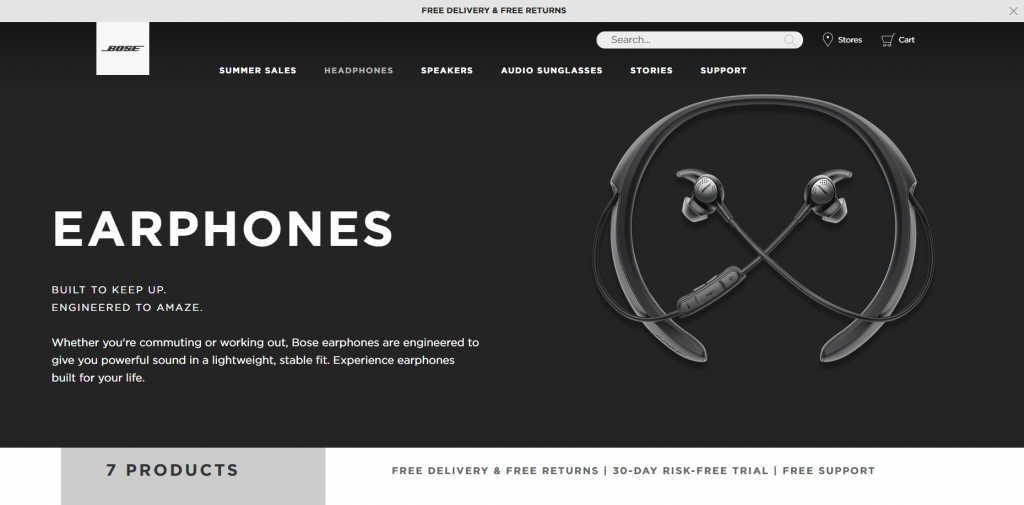
After clicking on the above advert, I came to the following landing page:
- The theme is very minimalist, which goes with the brand and design-cues of Bose.
- The navigation menu expands upon hovering, allowing the web user to see all of the different types of products Bose offer. This means even mis-clicks will find what they want on this page.
- Including an image in the center area of the landing page for the earphones makes it the center attraction of the landing page: the way it should be for product pages.
- Some content is displayed above the fold, using fonts to encourage the web user to read the largest font first, and smallest last (if the web user is interested enough to do so).
- Having how many earphone products Bose have appear just above the fold strongly entices the web user to see the products Bose sell. This will allow the web user more chance to find the earphones they were originally searching for to buy.


