The last PPC campaign I analysed in the ‘Analyse A Real PPC Campaign’ series was from iScootCo, who had a PPC campaign that competed against Google shopping sponsored results, which meant that iScootCo had to use call to actions in their search title to grab the reader’s attention and into a click. The main problem with the campaign, though, was the fact that the landing page was badly formatted, meaning the contents of the landing page did not fit the screen of the device viewing it. This would have frustrated a lot of web users, contributing to a high bounce and exit rate.
With us heading into May, now is never been a better time to start thinking about holidays for the summer. With this, here is an analysis of a PPC campaign from Love Holidays.
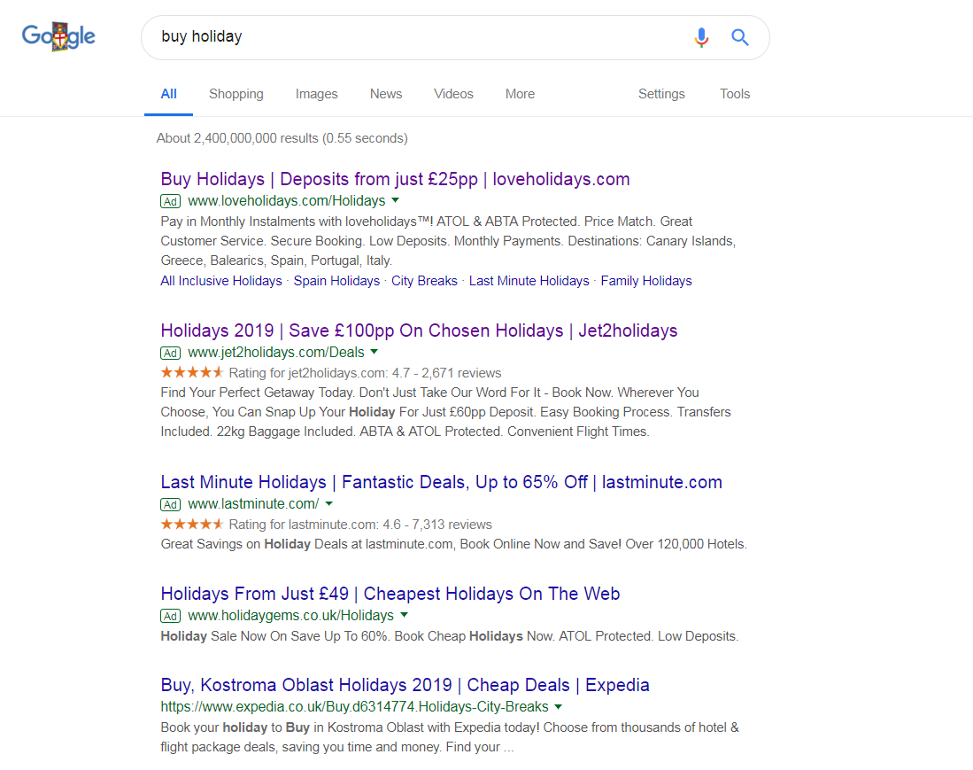
To view Love Holidays’ PPC search advert, I had to type into Google search UK, ‘buy holiday’:
The site links extension has been used too, to give the web user more choices so that they can go to the type of holiday they want, without landing onto the main landing page. It is also clear that Love Holidays are targeting those looking to save money but go on holiday, from mentioning the cost of deposits, as well as monthly installments. Considering this is the only advert that mentions such way to pay for holidays, this helps to differentiate Love Holidays from the competition.
After clicking on the above advert, I came to the following landing page:
- Where they want to go (destination)
- Departure airport
- When they want to go
- How long for
- How many people are going
Once this information has been filled, the results will populate for the web user to browse through.
The idea behind this landing page, then, is to make it as easy and appealing for the web user to populate the lead captures. This is helped with a blue theme and blue pictures of blue seas and skies, encouraging a holiday spirit. The boxes for the lead captures are also very large, so they are clearly seen and easy for the web user to interact with. The only problem I see with this page is that there is no connection between some of the information on the search advert to the landing page – it would have been useful for Love Holidays to expand upon their deposit and monthly installments scheme.


