The last PPC campaign I analysed in the ‘Analyse A Real PPC Campaign’ series was from Car Finance 247, who had a well optimised search advert, at the top of paid search results, with a really clear and effective hybrid landing page between a lead capture and click through page.
A brand of clothing that is known for its ‘surfer’ and summer look is Hollister. Looking at such a brand, here is an analysis of a PPC campaign from Hollister.
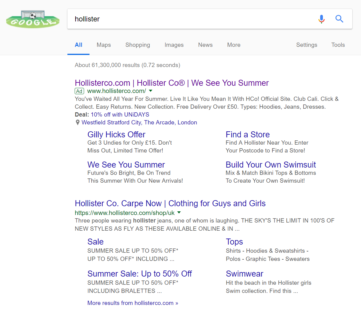
To view Hollister’s PPC search advert, I had to type into Google search UK, ‘hollister’:
This is an example of a PPC campaign that has targeted their own brand name. There are a few reasons for doing this:
- To war off competition
- To promote something different to the top organic result
- To change the page web users land onto, since they may not necessarily want web users landing onto the homepage every time they search for the brand name.
For Hollister, the landing page is exactly the same as the homepage. There is no competition. Therefore, the only reason it seems this PPC campaign exists is for point 2. The search advert can be most differentiated from the first organic result of Hollister’s by:
- Inclusion of the location extension – This informs the web user of the closest store to their current location.
- Addition of a discount – The advert has realized that a 10% discount could be applied to the web user, enticing them further into converting.
- Site link extensions. The links in this extension are different and more ‘in time’ with current trends than the organic search results.
From this, the web user is more likely to visit a store and convert, especially with the addition of a discount.
After clicking on the above advert, I came to the following landing page: As mentioned previously, this is exactly the same page as the homepage. In general, it is not a good idea to use a homepage as a landing page, since typically the homepage is not optimised for pay per click advertising traffic. However, in this situation, Hollister has made sure it is:
- The use of bright backgrounds and images of models wearing Hollister makes this landing page attractive to look at to the web user.
- There is a lack of content on this landing page, due to the fact that it can be seen as a click through landing page. On click through landing pages as simple as this one (where it is to direct the traffic based on whether they want men or women clothing), there does not need to be any content.
- The buttons to click onto are clear and located well so the web user immediately sees them once landed onto the page.
- The navigation menu is very clean and expands upon hovering, allowing the web user to explore any clothing they want.

