The last PPC campaign I analysed in the ‘Analyse A Real PPC Campaign’ was from Jet2Holidays, who had a generally good search advert with a good landing page, covered by a pop-up to capture a lead to send emails as a newsletter. Pop-ups are notorious on the internet. However, getting email addresses for holidays can prove extremely beneficial, since there is a strong possibility of repetitive purchases of holidays annually.
With summer approaching, temperatures have started to soar which will, no doubt, cause a flood of searches for ways to keep a household cool, such as air conditioning. With this, here is an analysis of a PPC campaign from ICS Cool Energy.
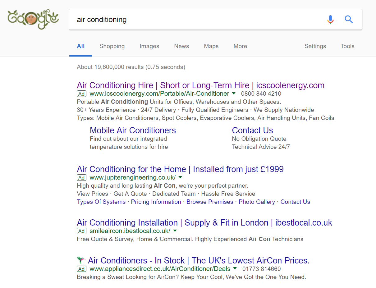
To view ICS Cool Energy’s PPC search advert, I had to type into Google search UK, ‘air conditioning’:
Looking at the advert itself, every section of the advert contains the main keyword ‘air conditioning’ (title, URL, description and site link extension). This will help to make clear to the web user just what ICS Cool Energy are all about, as well as increasing the contextuality of the advert further. The only drawback to this advert is the fact that there is a lack of a call to action anywhere. It would help to improve the click through rate to have a call to action, either in the title (at the end preferably for this advert) or embedded anywhere in the description.
After clicking on the above advert, I came to the following landing page:
There are a few wise decisions from ICS Cool Energy with regards to the general design of the landing page, outlined below:
- The theme of blue was a good colour to choose, considering blue is generally a colour associated with being cool.
- There is a number, filled in red, to get the web user’s attention if they are ready to convert to hire air conditioning. This makes it possible to gain conversions from such a product/service page.
However, there are also a few drawbacks to the landing page:
- The content below the fold is not laid out well and does not truly show off the capabilities of ICS Cool Energy and their products.
- The navigation menu at the top does not expand upon hovering and is quite boring in design (the dark sections to the menu do not work well for the landing page).
- The image of the air conditioners is not the most effective image to encourage web users to hire their products. Illustrating the effectiveness of the air conditioners, such as a room with ice inside it or an animation of a cool breeze, would possibly be a better alternative.


