The last PPC campaign I analysed in the ‘Analyse A Real PPC Campaign’ series was from Betfair, who had a PPC campaign to ward off competition from competing for their own brand name – the landing page was good but was only targeting new customers, with a lack of appreciation for existing customers who wanted to bet with their current Betfair account.
For this analysis, we will be looking at the watch industry and the company Swatch. With this, here is an analysis of their PPC campaign.
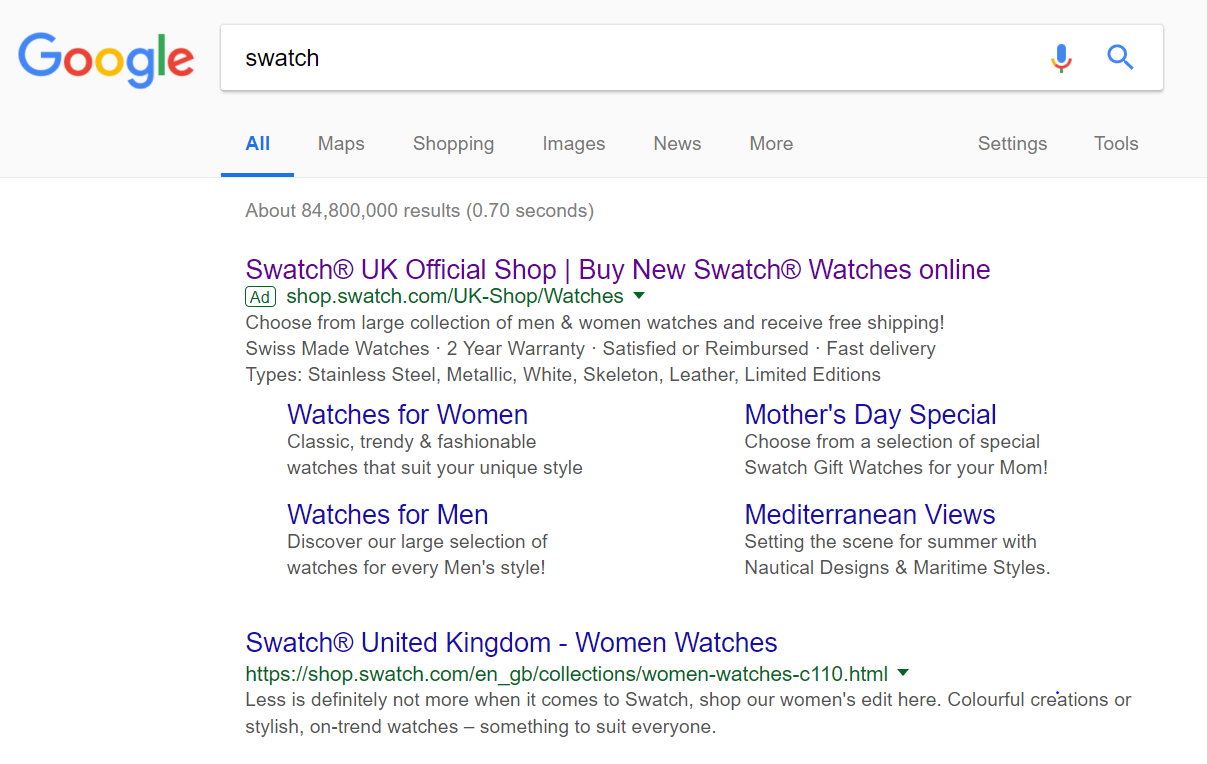
To view Swatch’s PPC search advert, I had to type into Google search UK, ‘swatch’:
- To change the title and description of the first result that appears. This happens when the organic result does not satisfy the company, which might be the case considering the first organic result targets only women and does not universally look at Swatch as a brand for men and women.
- To expand the result with site link extensions. The site link extensions provide good links for the web user to click onto, splitting watches for men and women. However, it is clear that the advert has not been updated considering one of the links is for Mother’s Day. In this situation, it is an example of how not keeping your adverts up to date can affect the performance of them negatively. Always make sure your advert in your campaign are up to date, otherwise you might be wasting away your PPC budget.
After clicking on the above advert I came to the following landing page:
- The image slideshow is there just to showcase the range of beautiful watches Swatch have on offer. Images are often worth a thousand words on landing pages and this is no exception for Swatch.
- The landing page is all about the menu, which is a masterclass. The menu expands upon hovering, allowing the web user to see the whole range of watches Swatch has on offer, all from just hovering their mouse. This is accompanied by images in the hover sections.
- Although there is not much of an incentive to go below the fold, what appears are linked images to the different types of watches Swatch have for sale. This helps to keep the web user’s attention with colour and exciting images of watches to browse through.


