The last PPC campaign I analysed in the ‘Analyse A Real PPC Campaign’ series was from Monster, who had a great search advert and landing page on the whole. However, the fact there are two businesses with the same name (Monster energy drink and Monster jobs) means the keyword targeting might need to be a bit more specific to prevent budget from being wasted on the wrong target audience.
Although YouTube is dominant for video online, I thought I would see what PPC campaigns appears when searching for alternatives to YouTube. With this, here is an analysis of a PPC campaign from Vimeo.
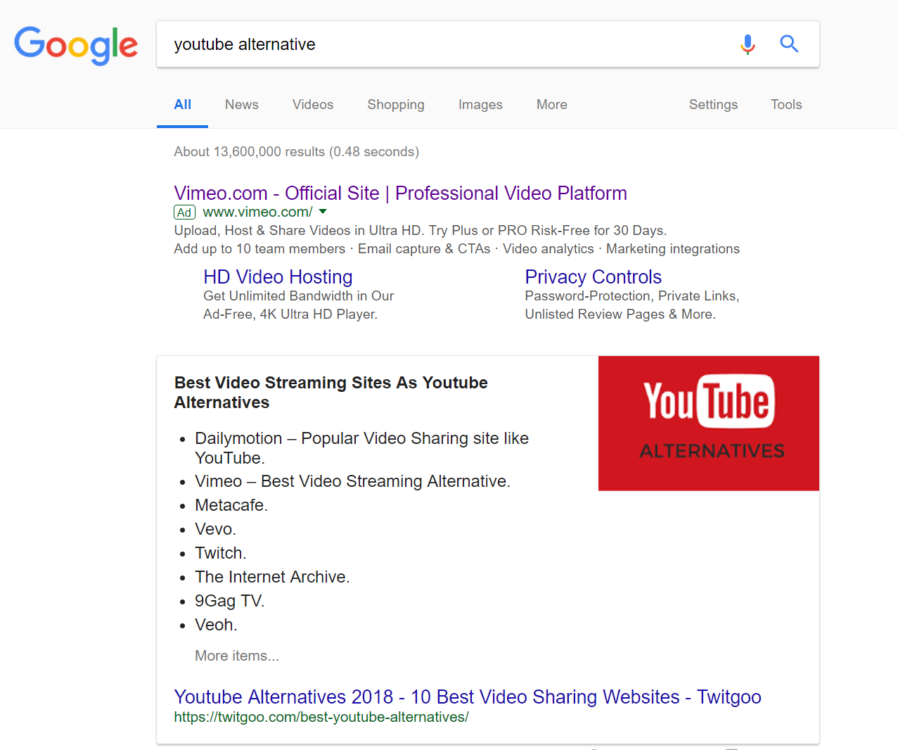
To view Vimeo’s PPC search advert, I had to type into Google search UK, ‘youtube alternative’:
Battling against competitors in PPC is hard enough and it is even harder when it is against contextual rich snippets. To counter this, Vimeo have used the sitelink extension to expand the size of the advert and provide more links the web user can click onto. The brand name is mentioning heavily in the advert whilst using words such as ‘Professional’, ‘Ultra HD’, ‘Ad-free’ and more all helps to entice the web user into clicking on the advert.
After clicking on the above advert, I came to the following landing page:
- I like the use of buttons for this click through landing page. But, the choice of colours for the buttons could be improved, since there are 3 different colours for difference subscriptions, which seems a little confusing (is light blue meant to be more attractive than the dark blue used for Vimeo Plus)?
- The landing page is extremely bland. This is mainly down to the white background, which really illustrates just how little content there is on this page. I cannot understand why Vimeo have advertised Ultra-HD etc. and not used an example of a screenshot or snippet from some colorful and exciting video that is on their website, even in a slideshow.
- There is no search bar or navigation menu, which makes it difficult for the web user to explore Vimeo and get an understanding as to what the video platform is like. Instead, Vimeo is giving the web user an ultimatum ‘yes I know this landing page is bland and minimalist, but you either exit the page or sign up to a paid subscription’.
- The targeting of Vimeo seems a little off, considering YouTube is free – Vimeo needs to make clear just what they offer that YouTube cannot, which makes the subscription fee worthwhile.


