The last PPC campaign I analysed in the ‘Analyse A Real PPC campaign’ series was from Voucher Honey, who had a well designed search advert and an exception landing page, mainly due to the simplicity of just a search bar that takes up the central area to it. With Christmas now nearly a month and a bit away, it is that time of year that retailers start to release their Christmas adverts for the year, which is incidentally becoming quite a big thing to do. With this, here is an analysis of the John Lewis advert, who can be considered the retailer that started the ‘hype’ around Christmas adverts.
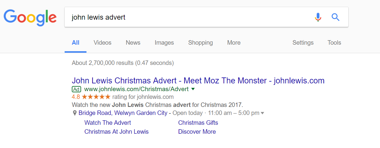
To view John Lewis’s advert, I had to type into Google search UK, ‘john lewis advert’:
- The top organic search result goes to YouTube. However, for the web user this represents a ‘dead end’ for John Lewis – it would be much more beneficial to have the web user view the video advert on John Lewis’s website so that they can continue browsing the site.
- There is a lot of news about the advert, which is above organic results, illustrating mixed responses to the advert. John Lewis would rather steer the web user from seeing this through getting them to click onto the advert.
- John Lewis used three ad extensions in this advert to:
- Make clear they have a great rating.
- Add links to different areas of their website.
- Show the web user the nearest John Lewis store in relation to their location.
- The description is a straight-forward call to action, which will work well to increase the CTR of the advert.
Overall, this is a excellent example of a search advert.
After clicking on the above advert, I came to the following landing page:
The central area to this landing page is, of course, the advert. However, as stated about the search advert, what John Lewis want to do is get web users onto their website, so that they can browse the products and buy stuff through John Lewis – something that is not possible from watching the advert on YouTube.
What is important, for this landing page, is that the top area of John Lewis’s advert is unaltered, so it is possible for the web user to browse John Lewis like they would do when interacting with the navigation menu bar.
John Lewis have also been tactical in having the YouTube video appear slightly below the fold of the page. This will work to entice web users to scroll below the fold, where they can see extra information and merchandise relating to the video advert. From this, overall, this is an effective landing page and PPC campaign.


