The last PPC campaign I analysed in the ‘Analyse A Real PPC Campaign’ was from PULL&BEAR, who had used the site link extension to make it easier for each gender to find clothing, instead of having to go through another click through page to then select ‘mens’ or womens’ clothing: making life a little easier for the web user. With the holidays approaching, I am sure there are a lot of people looking to utilize discount and voucher codes online to help with the cost of holiday shopping. With this in mind here is an analysis of a PPC campaign from Voucher Honey.
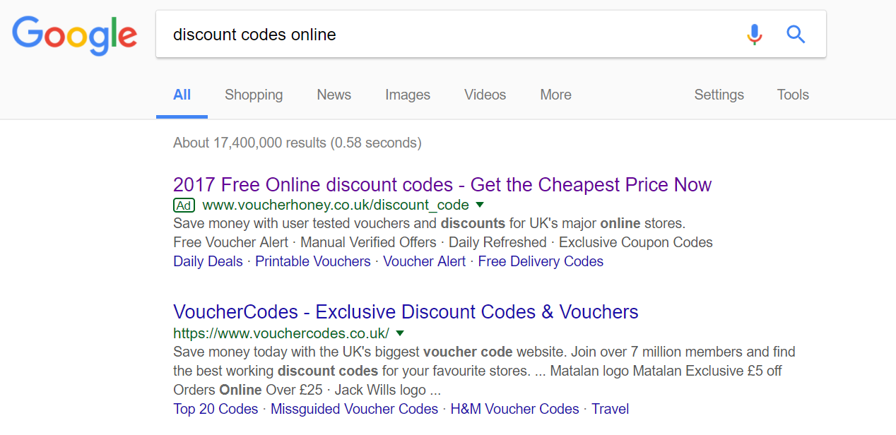
To view Voucher Honey’s PPC search advert, I had to type into Google search UK, ‘discount codes online’: Straight away, Voucher Honey is the only PPC search advert appearing for such a search phrase. This is quite interesting that the rest of the market do not feel the need to pay out to PPC to gain traffic from competitors. For Voucher Honey, the fact that they are not organically on the first page of results is a clear reason for making a PPC campaign.
Looking at the advert itself, it is a well designed search advert for the following reasons:
- Voucher codes are something with expiry dates. Therefore, it is good that Voucher Honey included the year ‘2017’ to make clear that it has the most up-to-date voucher codes.
- There is the use of power words in the advert, such as ‘Free’, ‘Now’ and ‘Save’.
- There is a call to action at the end of the title and at the beginning of the description, enticing the web user further into clicking on the advert.
- Voucher Honey used the site link extension to show relevant links on their website, as well as making clear of the services they have such as Daily Deals, voucher alert and the fact you can print adverts too.
After clicking on the above advert, I came to the following landing page: This is a really good example of a excellent landing page, with the following reasons why:
- All of the content is above the fold. There is no need to scroll below the fold for which Voucher Honey doesn’t give any enticement to do so, such as content half below the fold.
- The theme is very clean, using a combination of neutral colours with the bold orange.
- There is a lack of a navigation menu, which I think is a first for this series. This is a great idea as it stops any attention that would have gone to the navigation menu so that it stays with the central area of the landing page.
- The search bar is responsive and shows results upon typing, which is extremely effective. From doing this provides a great user experience as well as stopping the ‘middle man’ results page from appearing in order for the web user to get to the retailer to view voucher codes from them.
You must be logged in to post a commentLogin