The last PPC campaign I analysed in the ‘Analyse A Real PPC Campaign’ came from Waitrose Cellar, who had, on the whole, a good search advert and a good landing page, which was a click through landing page to allow the web user to find the type of wine they were interested in.
It’s be an eventful week in terms of technology and smartphones with Samsung having recently unveiled their new flagship smartphone of 2017: the Galaxy S8. Like with all new products that are released, Samsung needs to fund a marketing campaign to spread awareness to the public that they have released their new flagship smartphone of 2017. Therefore, without further ado, here is an analysis of a PPC campaign from Samsung for the S8.
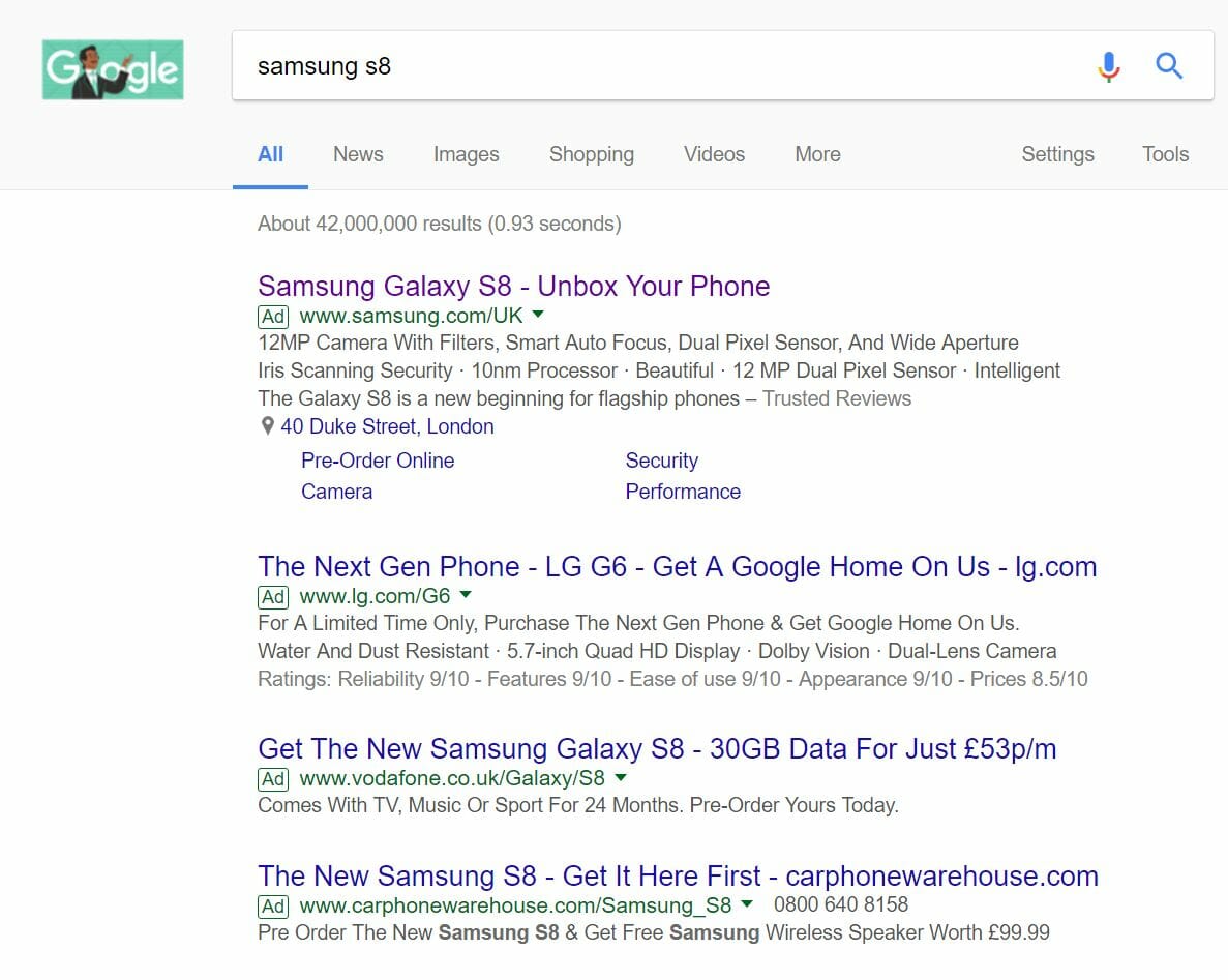
To view Samsung’s PPC search advert, I had to type into Google search UK, ‘samsung s8’:
Looking at the advert itself, it is a great designed search advert for the following reasons:
- The title addresses the phone name as well as the slogan for the phone ‘Unbox Your Phone’, which is deliberately vague to get the web user’s attention as to what it means (where it means to remove the bezels surrounding the screen of typical smartphones).
- The description is packed with information about the specifications and features of the phone, which would provide more enticement to the web user.
- The choice of ad extensions used are great because:
- The review extension gives the advert an objective look, for which web users will appreciate (as who does not read or watch a review before buying a phone nowadays)?
- The location extension illustrates the nearest store to where I can hold an S8 in person.
- The site link extensions allow the web user to view different areas of the product page, for which is assumed as the landing page for this advert.
After clicking on the above advert, I came to the following landing page:
Apart from the stunning image used for this landing page, there are a few other features of the page which are well optimised for what Samsung wants: preorders:
- A preorder button features in the top right of the fixed floating navigation menu, so the web user can click preorder no matter how far they have scrolled down.
- All of the features and areas to look into for the S8 are contained to the left of the menu, so the web user can explore that.
- An arrow points downwards in the bottom right corner to signify to the web user that there is content below the fold.
From this, all in all, this is a brilliant PPC campaign.


