The last PPC campaign I analysed in the ‘Analyse A Real PPC Campaign’ was from Viagogo, who had a good search advert with a click through landing page designed to induce a sense of urgency, such that the tickets the web user was searching to buy would sell out soon (and hence the web user would be less price-sensitive when they see the ticket prices). The online alcohol industry is a competitive market with many websites offering a range of wines, beers and ales. With this in mind, here is an analysis of a PPC campaign from Waitrose: their wine section which is known as Waitrose Cellar.
To view Waitrose Cellar PPC search advert, I had to type into Google search UK, ‘buy wine’: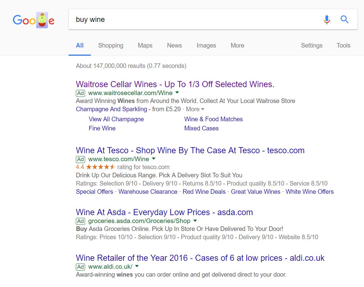 Straight away, we can see the competition for a crucial search phrase is high and rightly so – this is potentially the reason the adverts that do show are from the four largest supermarket brands in the UK. There would have been other smaller companies bidding for such a keyword search phrase. However, they most likely could not afford the CPC that the larger supermarket chains could afford in their marketing budget.
Looking at the advert itself, Waitrose have mentioned the brand name and a discount incentive in the title, whilst the description is kept to a minimum of one line to add emphasis on other areas, such as the site link extensions. This is a good move by Waitrose since they want the web user to explore the range of wines, how old they are, the ingredients used and more before buying.
After clicking on the above advert, I came to the following landing page: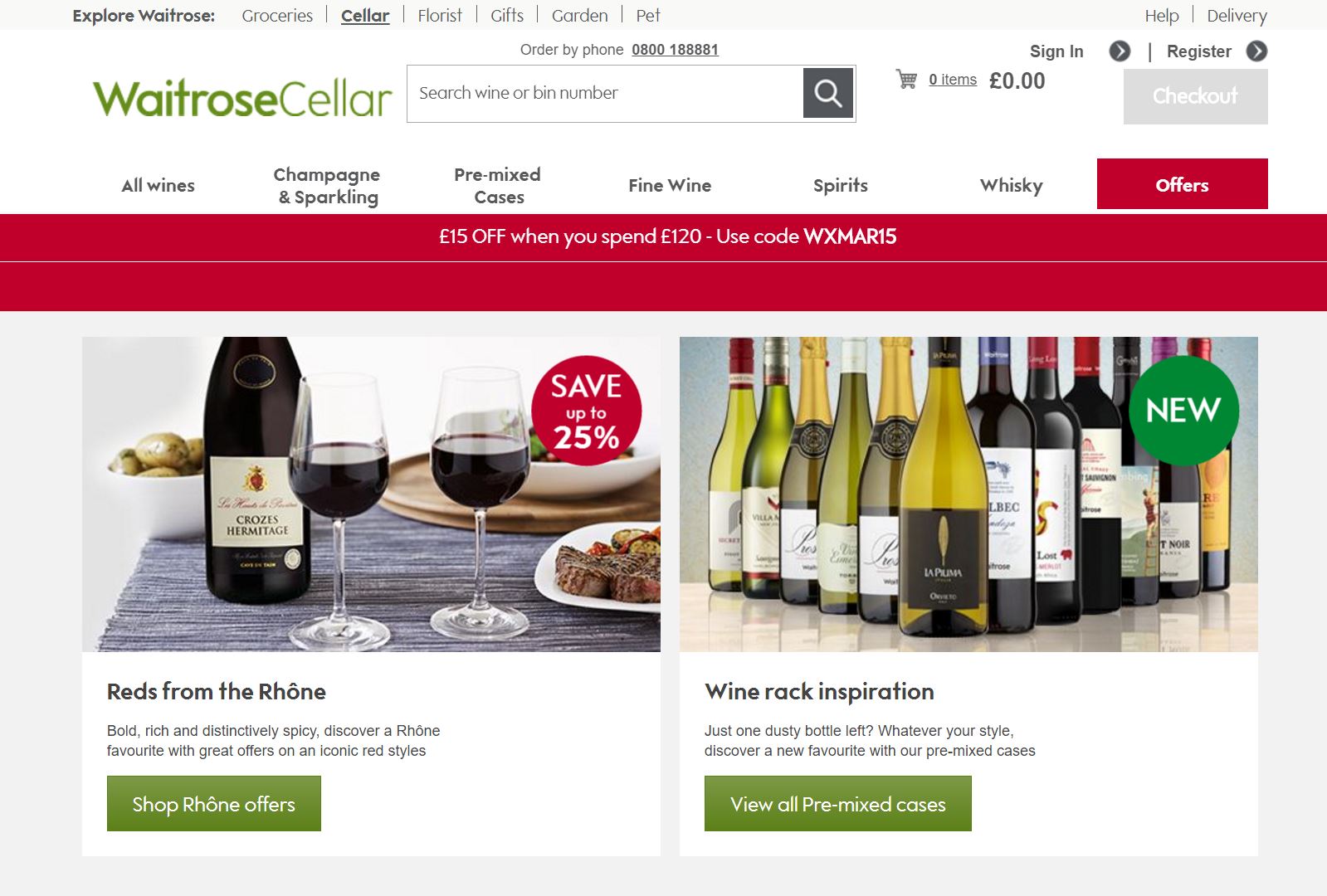 From the two large options the web user can click onto, it is clear this is a click through landing page. Waitrose wants the web user to split amongst two paths of wines so that the page after this one is more contextual to the wine the web user is searching for.
As well as this, it is a great idea that Waitrose have put a discount code onto this landing page. From doing this, it gives the web user more reasons to shop wine at Waitrose Cellar. This is backed up by the fact that the discount area is in red, which is a colour which would induce a sense of urgency to the web user – in this case, to buy wine from Waitrose Cellar.
What is also very nice about this landing page is the navigation menu Waitrose Cellar have used, which allows the web user to click onto the specific wine he or she wants to buy, with the use of a hover-expand navigation menu – these types of menus are great at displaying more information than can be packed onto a landing page, allowing for the next page to be more contextual to the web user’s taste in wine. So, all in all, this is a good landing page and campaign by Waitrose Cellar.

You must be logged in to post a commentLogin