The last PPC campaign I analysed in the ‘Analyse A Real PPC Campaign’ series came from David Lloyd, who had created a campaign to get those looking to get fit for the new year to sign up at their gym. As much as it was good, it did not advertise the numerous facilities David Lloyd offered – it focused only on the gym in the landing page which, I feel, was good for a certain percentage of the traffic but not all of them (since some might do Squash, some might like to swim only etc.).
With the Detroit motorshow occuring over the last week or so, I thought it would be a good idea to see what PPC campaigns appear for someone wanting to buy a new car. Therefore, without further ado, here is an analysis of a PPC campaign from Carwow.
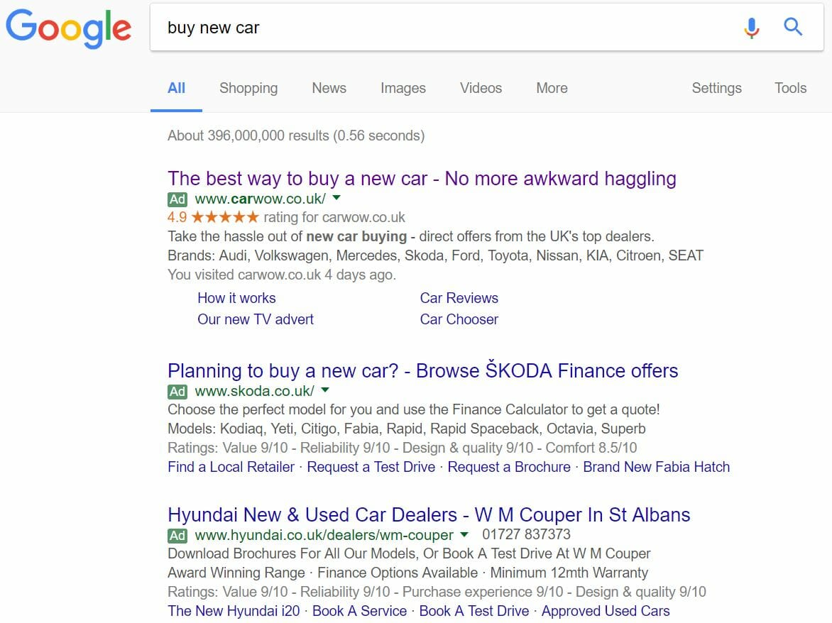
To view Carwow’s PPC search advert, I had to type into Google search UK, ‘buy new car’:
Anyway, looking at Carwow’s PPC search advert, it is a very well designed advert in general. It has a great use of ad extensions to add a high review and links, which also expand the advert giving it more exposure. The description contains a continuation of the title and includes many well know automotive OEMs, which will attract web users interest and curiosity into clicking onto the advert, that it takes the ‘hassle’ out of buying new cars – how does Carwow do this?
After clicking on the above advert, I came to the following landing page:
- Large images are always a winner on landing pages, since images are much easier to view on the eye than lots of text and add colour (through the bricks on the houses and trees) to the landing page. Having a car at the focus of the image gives intention to what Carwow is about, buying a car.
- The navigation menu is a dream to use, expanding with many different options ranging from the different manufacturer of cars the web user might be interested in to articles that should help people buying a car, which uses a drop down list with images for each link. This is the first time I’ve seen images in a drop down menu upon hover for a landing page – it certainly works.
- There is content below the fold of the page which is where the information behind Carwow is and how they work. This is illustrated with the arrow pointing down and the text above it, ‘Find out more’.
- The two large buttons are appealing to the web user to click onto, both being large, clear and one being colourful. Therefore, it is clear this is a click through landing page.


