The last PPC campaign I analysed in the ‘Analyse A Real PPC Campaign’ series was from Google Home, which was extremely cheeky from Amazon. They knew the Google Home has not come out in the UK. But, still they made a campaign for it which, when you type ‘Google Home’ into Amazon, Amazon’s own Echo comes up as the top result. With it being the start of the new year, there are going to be lots of new year resolutions happening, with the favourite being to get in shape. Therefore, it would be interesting to see a PPC camapign from a gym. With this, here is an analysis of a PPC campaign by David Lloyd.
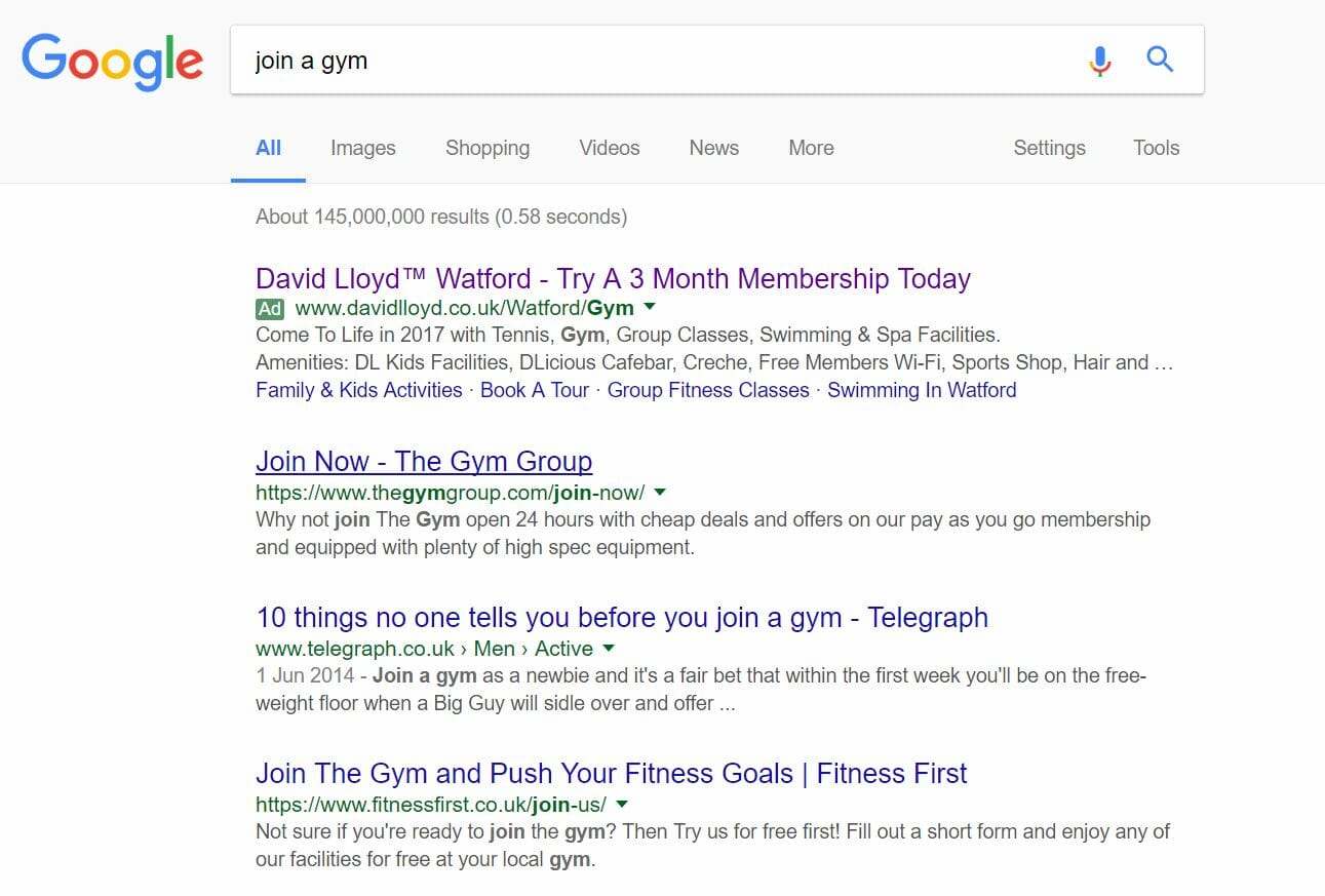
To view David Lloyd’s PPC search advert, I had to type into Google search UK, ‘join a gym’: Straight away, it is surprising to see how little competition there is for such a crucial keyword. Yes, it is going to be geo-targeting to make sure the gym is in a nearby location to myself. But, just one advert?
One of my family relatives works in this industry and the company he works for won’t actually allow employees to have time off in January, simply because it is their most successful month and when the majority of income comes in. Therefore, it just seems a missed opportunity by other gyms to not make PPC campaigns for this keyword.
Looking at David Lloyd’s PPC search advert, it ticks a lot of boxes to being a good PPC search advert:
- The brand name is mentioned in the title
- They have an incentive to lure web users in of having 3 months free
- They have located the nearest gym to my location in the title
- The description relates to people who chose getting fit as their New Year’s resolution, ‘Come to life in 2017 with…’
- Listing the facilities David Lloyd offers makes clear it is has everything for everyone.
- The use of the site link extenson gives the web users more areas to click onto, which David Lloyd feel web users would be interested in.
After clicking on the above advert, I came to the following landing page: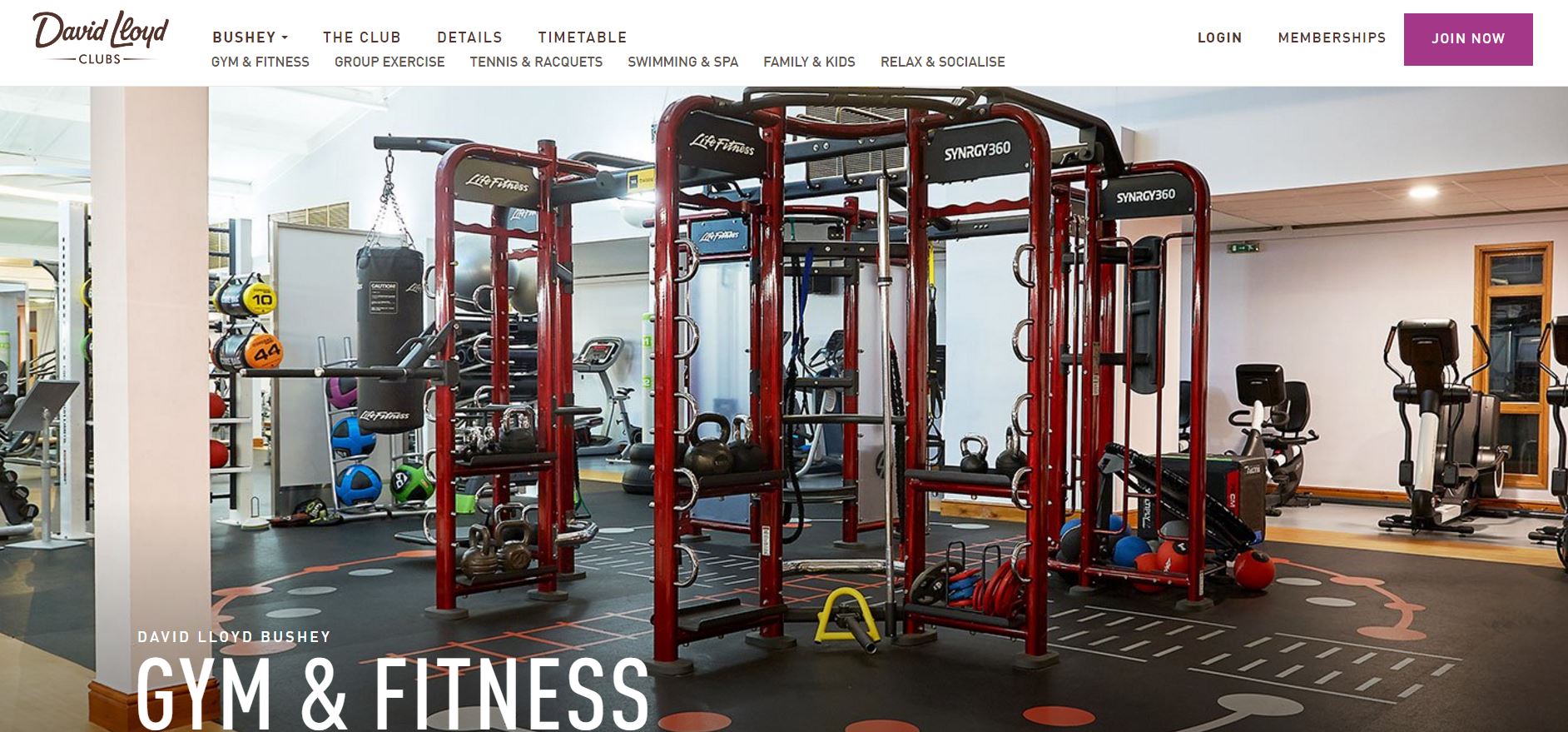 There are both good points and bad points to this landing page outlined below:
- Images are always a win-win for landing pages. From displaying a clear image of the weights section to their gyms really does make the facilities of David Lloyd look very good.
- The top navigation menu is also very effective, providing numerous links for the web user to explore the rest of the website.
- The fact the ‘Join now’ button is in purple is great since it differentiates it from the rest of the web page, making it stand out.
- However, this is great for those that want to use the gym. But, people wanting to get fit for the new year don’t always go to the weight section but other areas such as the treadmill, cross trainer or swimming. Therefore, it would have been better if David Lloyd stuck the background image on a timed slideshow, to display the numerous facilities they have, just like they listed in the search advert.
- There is content below the fold of this page. However, there is nothing to suggest this. It would have been better if there was an arrow in either corner which pointed downwards, signifiying content below the fold.
You must be logged in to post a commentLogin