Landing pages are such a crucial element to a pay per click campaign for the simple reason that it is the point of the campaign where the conversion will take place. You could have attracted the most contextual traffic to your landing page. However, if your landing page fails to impress, you will have just paid for traffic which do not provide the results you were expecting. For this reason, it is critical to make sure your landing page is optimised and will gain a high conversion. Here are three effective elements to include on a landing page to help your page gain a better conversion rate and become more successful.
#1 At Least 1 Large Image
Web users love images and hate content – that is a fact. For this reason, always try to include one large image on your landing page to compliment the content you have on there. If you look through my articles at the ‘Analyse A Real PPC Campaign’ series, you will see that the vast majority of PPC campaigns I have analysed all use large images on their landing pages. This is no coincidence. Images can be digested better by the reader and can even be worth more than a 100 words of content on a landing page.
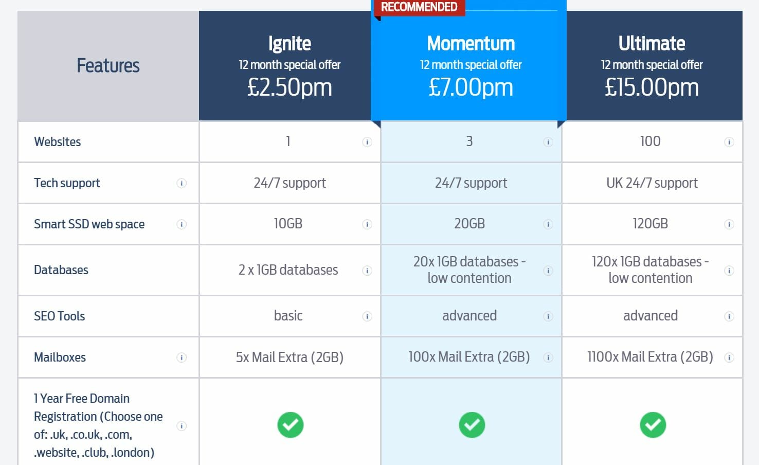
#2 Side by Side Comparison Below the Fold
This is not going to work with every landing page and campaign out there. However, for those that offer 2-3 products/services, you may find your landing page is good at bringing conversions. But, conversions from the cheaper selling products/services and less so from the ones that provide the greatest profit margin. For this reason, it is extremely effective to have a side by side comparison or table below the fold of your landing page to make it clear what each of your product/services does. Not only does this inform the web user and provide them the ability to pick the product/service that best suits their needs, you can use different colour scheming to entice web users into purchasing the product/service that is best for you. Take the below example where the landing page has one of the options highlighted to bring it more attention.
#3 Use the 1-1-1 Rule
The 1-1-1 rule is a great rule to stick to in a landing page that can help to improve your conversion rate. It consists of:
- One proposition – This will relate to what you are promoting and something that should benefit the web user.
- One message – After the proposition, you can use a message to expand on the proposition such as to highlight the main reason to buy it etc.
- One call to action – Referring to just above the fold (below the fold you can have another CTA), after the message, you can use a CTA to entice the web user into performing the task you want to them to do which will achieve you a conversion.
The great thing about the 1-1-1 rule is that it can pretty much be used on any type of landing page and is extremely easy to implement.


