The last campaign to have been analysed in the ‘Analyse A Real PPC Campaign’ series was the new service provided by Apple called Apple Music. What we found was that the campaign, on the whole, was excellent which comes as no surprise since Apple do tend to make products people want and continue this throughout their PPC campaigns. With is being the start of summer, it is that time of year when all the trees turn green, all the flowers bloom and all of those allergic to their pollen start to sneeze. For this reason, let’s analyse a campaign for hayfever. For this reason, I will be looking into Benadryl’s PPC campaign.
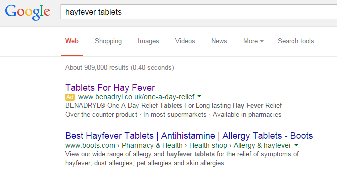
To view Benadryl’s PPC search advert, I had to type into Google search UK, ‘hayfever tablets’:
The advert itself is clever in that it is trying to look as much like organic search results as possible. Compare it to previous ‘Analyse A Real PPC Campaign’ articles and you will see how sneaky Benadryl are being. Although it is an ad, they want the web user to mistaken it for #1 organic search result which is a tactic some advertisers take in PPC.
After clicking on the above advert, I came to the following landing page:
- The text on the information is limited and has a large font size. This makes it easy on the eyes to web users reducing the landing page’s exit/bounce rate.
- The centre attraction of the landing page is the Benadryl One Day Relief box which is a great technique because web users will now be able to recognise Benadryl tablets in other stores if ever they should go into a supermarket etc. to buy hayfever tablets.
- The navigation menu are placed excellently. The products are on the left and shows the wide range Benadryl have on offer while some useful links are at the top of the landing page.
- The ‘Key Benefits’ makes clear there is information on the landing page below the fold of the page. Therefore, it encourages web users to scroll down to see the rest of the information (which contains more text. This is okay since the web user has a stronger interest in the landing page if they have scrolled down so more text is okay).
- Blue is a soothing colour to use for this landing page which links in with what the hayfever tablets do – soothe symptoms.


