The last article to have been analysed in the ‘Analyse A Real PPC Campaign’ was OfficeFurnitureOnline, who had seemed to create a good search advert but had an awful landing page for so many reasons. In this article, with the trend of music coming into online subscriptions, I thought it would be a good idea to see what adverts appear for such a market. For this reason, here is a analysis of Apple’s campaign for Apple Music.
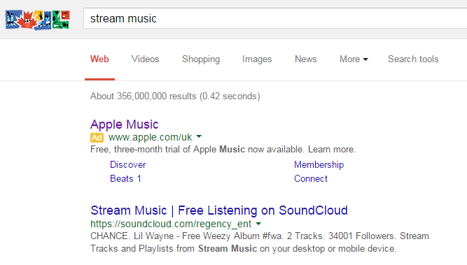
To view Apple Music’s PPC search advert, I had to type into Google search UK, ‘stream music’: There are a few reasons Apple have decided to make a campaign for such a keyword search phrase:
- Apple Music does not appear anywhere on the first page of organic search results. Therefore, to gain traffic for such a crucial keyword, they will need to use PPC.
- More importantly, to spread brand awareness for their new service. Apple Music has only just been released so Apple need to promote the service so that, before anything else, people know they have entered the market into music streaming.
Looking at the advert itself, it is clear Apple have stuck to their minimalistic styling for search adverts like they have done with the iPod Touch. There are many good points to the search advert:
- Apple have used the power word ‘free’ – you can’t go wrong with something that is free!
- The title is Apple Music so brand awareness is as high as possible with the search advert.
- They have used the site link extension to promote a healthy CTR.
- They have used a call to action at the end of the description to entice a click.
My only criticism is that the link names for the site link extensions are pretty, well, I would not want to click on them because I don’t know the type of page I would land onto. Connect? Beats 1? It needs elaborating before I click onto them.
After clicking on the above advert, I came to the following landing page: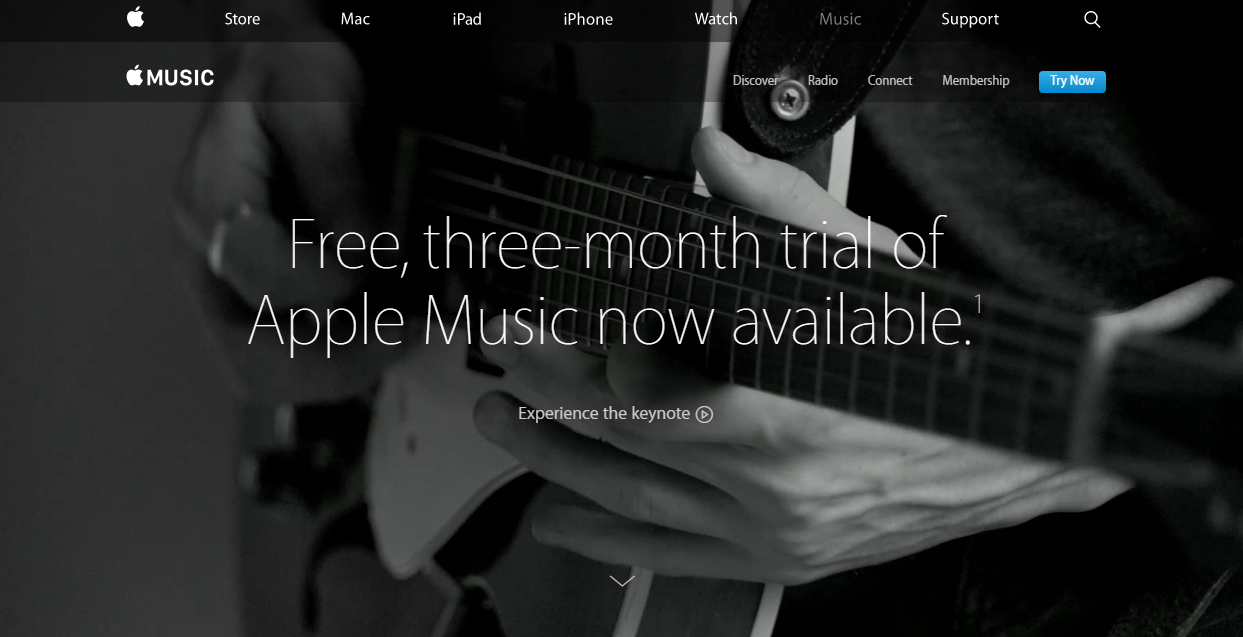 This landing page is great for a number of reasons:
- The background and majority of space on the landing page is taken up with an image. This will help massively in effectively portraying what Apple Music is all about: music…simple.
- The navigation menu at the top is effective in enabling the web user to see any part of Apple’s website.
- The ‘Try Now’ button is in blue contrasting to the whole landing page so it gains extra attention. This suggests it is a click through landing page.
- There is a small arrow in the central lower area of the landing page to signal to the web user there is more to this landing page below the fold of the content.
You must be logged in to post a commentLogin