The last article to have been analysed in the ‘Analyse A Real PPC Campaign’ was The Book People, who had a generally great campaign that would have converted the traffic they targeted well from the use of vibrant colours, financially incentives and many images on the landing page. In this article, I am going to look at a market that can be considered to be fiercely competitive: the water market. For this reason, the campaign I am going to analyse will be from Euroffice.co.uk.
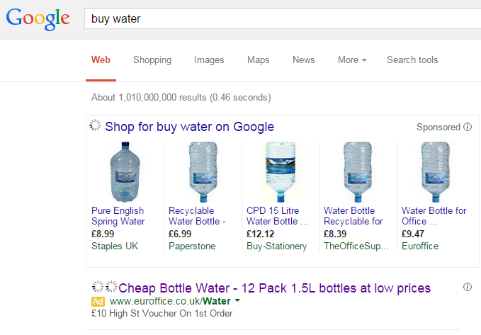
To view Euroffice’s PPC search advert, I had to type into Google search UK, ‘buy water’: The first thing I find apparent is the fact they are the only standard search advert for this keyword phrase. This could work in their favour since it might help the advert seem more like organic traffic.
With the water market, there is no need for Euroffice to publicise their brand name since it is not like the web user will have any loyalty with them – water can be bought just about anywhere. This is why Euroffice have only mentioned their brand name once – so that character space can be saved to entice the web user in through other means (or to make the advert simply look cleaner).
It is clear from the advert that Euroffice are trying to be price sensitive too. They want to attract the web users because they offer a voucher as well as low prices for water. Since they do not display any pricing, this might work in their favour to gaining a high CTR.
The main problem I have with this advert, though, is the fact it doesn’t tell me, the web user, what to do. Call to actions are so critical to the performance of an advert that there is extremely few reasons to not include even the shortest of CTAs (that could literally be two words long). I feel this advert will perform better with a call to action in either the title or description.
After clicking on the above advert, I came to the following landing page:
After clicking off the pop up, the following landing page appeared:
It’s quite cheeky that Euroffice have displayed the pricing of the water excluding tax to make the water seem even cheaper than it is. Although this is allowed, it might turn some web users away when they find an additional 20% will be added to the final price of the water. So, in theory, the discount at the start is only to combat the tax addition to the water.


