
The last article that was analysed in the ‘Analyse A Real PPC Campaign’ was Singapore GP, who created a very premium feel to the campaign to make the web user want to buy the ticket to the Grand Prix at any cost. You will tend to find campaigns do this if their pricing is not sensitive towards their target market – in order to succeed, they need to create USPs so that the web user buys the product/service at any cost because of the USPs (a good example of this is Apple). Away from the mahem of F1, I will be looking at a campaign of a book store called ‘The Book People’.
To view The Book People’s search advert, I had to type into Google search UK, ‘book store’: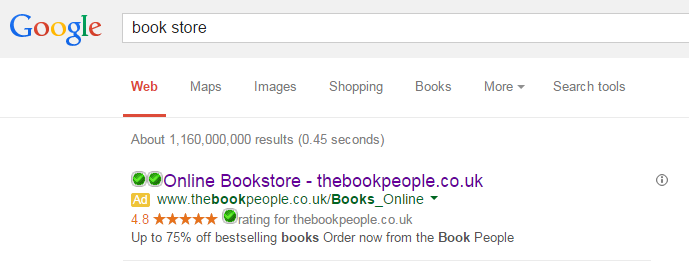 The interesting thing I spot out straight away about this advert is that there are no other adverts present above organic search results. This is great news for The Book People because if competition is low, the CPC they will have to pay to get the ad position they currently have will be much lower. This means their budget can stretch further for more contextual traffic.
Looking at the advert itself, it has the following good points:
- The Book People have put the URL of their website in the title so that the web user can remember it and go direct if he or she wanted to.
- The advert is packed with keywords which makes it seem very relevant to what I searched for. I searched for a book store, this is a book store, so there is not much reasoning for me not to click onto this advert.
- The description starts with addressing the price sensitive web users and then finishes with a call to action. This is a great description because, in essence, The Book People are enticing the web user with their offer and then telling them what to do after.
- The Book People use the rating ad extension to make clear that web users are happy with their service and products.
After clicking on the above advert, I came to the following landing page: After finding out what the design of the homepage is, the landing page The Book People have used is their homepage – the only difference comes in the URL which is different so The Book People can track PPC as a traffic source to see how they interact with the page. In general, a well designed homepage can be used as a landing page and this is the case for The Book People:
- Bright vibrant colours with a minimalistic background design help to make the page pleasing on the eye.
- There is a wide use of images which are effective in displaying information in a nice and easy-to-read way so that web users do not become bored with text.
- The navigation menu is effective in letting the web user access any part of their website.
- The best thing about this landing page is that there is a ton of information on it. However, The Book People have been clever in the sense it does not look packed with information at all – they have been very good on the spacing of content for this page.
You must be logged in to post a commentLogin