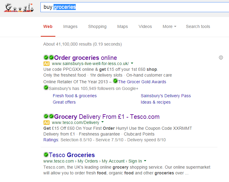
Although this article is strictly, not part of the ‘Analyse A Real PPC Campaign’ series (check out the last article in the series), it has some links to it. In this article, I will be looking at two of the biggest supermarkets in the UK: Tesco and Sainsbury’s. The way I will be looking at these two giant supermarkets, though, is through the use of pay per click advertising. How do these two supermarkets use PPC advertising to their benefit? Who has the more appealing search advert and why?
The first point I want to make is that there are only two supermarkets bidding for the search phrase, ‘buy groceries’. This means that Aldi, , Lidl and Asda decided not to create campaigns for this crucial keyword phrase. This is interesting since the ones that are not advertising in PPC are in fact, in general, cheaper supermarkets. Does this prove the point that the savings are forwarded onto the consumer because Aldi, Lidl and Asda do not fund money into PPC advertising? Maybe it is a small contributing factor nonetheless.
Looking at Tesco’s advert, it is clear that they are trying to be price sensitive to attract the web user by including the numerous amount of figures in the advert.
- The title screams out price sensitivity, by including the fact deliveries only cost £1 which seems rather cheap. As well as this, they included their brand name which is always good to encourage publicity.
- The description uses a great call to action of ‘Hurry!’ making it seem like the voucher is only valid for a certain period of time. This along with the short phrases after the voucher make for a great description.
- Tesco used an ad extension being the ratings extensions, displaying the selection, service and delivery out of ten. This will help entice the web user to using their service since the ratings are 7s/8s out of ten.
Looking at Sainsbury’s advert, it has gone for the same approach that Tesco has gone for, looking at price sensitivity knowing consumers prefer going to the supermarket which is the cheapest.
- The title is extremely short and to the point. This can work to and against Sainsbury’s since it lacks any pricing or branding but does tell the web user exactly what the whole campaign is about.
- The description is similar to Tesco that it has a voucher although the call to action does not inject any sense of urgency into the web user to use their service like Tesco did.
- The ad extensions Sainsbury’s have used make clear they are the best online retailer of the year, have a large Google+ following and have extra links to different areas of the site, giving the web user more choice to what part of the website he or she wants to go to.
Ultimately, I think Tesco have done a better search advert. Sainsbury’s advert is good. However, it does stray a bit from what really matters. You can be the best online retailer of the year, but if that costs the web user more money than the next best thing, then its all for nothing. For supermarkets, it is all about reducing weekly shopping costs and Tesco has recognised this.


