The last PPC campaign I analysed in the ‘Analyse A Real PPC Campaign’ series was from Cyber Power, who had what can only be described as a PPC campaign that was slightly mis-targeted: an ‘i7 laptop’ does not straight away mean the web user wants a gaming laptop. Due to this, the whole campaign will be running pretty inefficiently.
On a separate note, here is a PPC campaign analysis looking at the cashback market, which enables web users to take advantage of affiliate cashback schemes to save even more when buying goods and services online. Here is a analysis of a PPC campaign by TopCashBack.
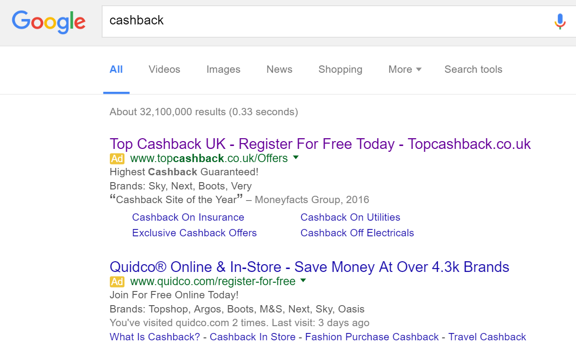
To view TopCashBack’s PPC search advert, I had to type into Google search UK, ‘cashback’:
Looking at the advert, it is pretty much a perfect search advert:
- The title is littered with the brand name and a call to action.
- The description is short and to the point because of the longer-than-normal title.
- Ad extensions are used to entice the web user further. I especially like the review extension used as this really does make TopCashBack seem the market leader in cashback websites: even if it is just an opinion from a third party website.
- The site link extensions increase the area the advert takes up and provides more links for the web user to click onto which will, all in all, increase the overall CTR of the advert.
After clicking on the above advert, I came to the following landing page:
What is great about this landing page is that it has all the content to fill a laptop screen but appears in a material design, which does not make the page seem as cluttered as it should do with the amount of content on it. For this reason, I have a strong feeling this landing page will work very well for TopCashBack and provide the results that TopCashBack want to achieve.


