The last campaign to have been analysed in the ‘Analyse A Real PPC Campaign’ series was the Sky Store, which had an ‘okay’ search advert and a really good landing page. With this article analysis, considering that buying any sort of tickets will have fierce competition, I thought I would look at the PPC campaigns that appeared for when it came to buying train tickets. There is obviously a market for this so let’s analyse a campaign from thetrainline.
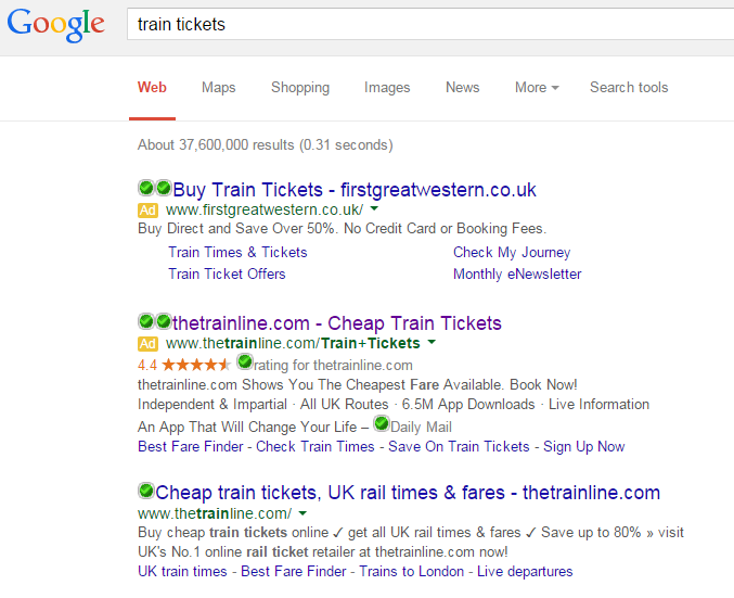
To view thetrainline’s PPC search advert, I had to type into Google search UK, ‘train tickets’:
- thetrainline have been forced into creating a PPC campaign to compete against firstgreatwestern.
- thetrainline wanted to land web users onto a different webpage of their website other than the homepage (which is what thetrainline’s organic #1 search result leads to).
- thetrainline wanted to use ad extensions to give the web user more options when it came to interacting with thetrainline online.
From this list, it is clear point 1 is correct. Point 2 is incorrect since the landing page for the PPC campaign leads web users to thetrainline’s homepage. Point 3 is potentially correct because although the organic search results give web users access to some site link extensions, the search advert has much more information and extensions such as the rating extension, a review and site link extensions. It is amazing by just looking at search results that you can understand why certain advertisers have created campaigns to compete for certain keywords!
After clicking on the above advert, I came to the following landing page:
Now, we know that it is not beneficial to use a homepage as a landing page…with the exception of only when the homepage is good enough to be used as a landing page. In this case, it is because:
- It is well designed and pleasing to look at on the eye – web users are not going to exit the page straight away.
- There is a lead capture box on the left which enables web users to find tickets for trains which is exactly why they clicked on the search advert.
- There is a navigation menu in the top right of the website so the web user has access to other areas fo the website easily.
The only bad point about this landing page is the Adsense vertical advert to the right. I understand that thetrainline uses Adsense adverts. However, this will have the possibility of losing them money because if the CPC for the advert on their landing page is less than the CPC they paid for the traffic to get to the landing page, they are losing traffic at a cost too! Therefore, I think it would be beneficial to get rid of the Adsense advert just for the PPC landing page.


