In a previous article, I have already looked at how the right size and type of advert can help you increase your CTR. After knowing what size and type of advert you are going for, you will need to know two extra things: what colour adverts to use and where to position your adverts on your webpage. As you will learn from a Google heat map and the meaning of colours, you may find yourself changing the positioning and colour of your adverts. After all, every publisher wants to make as much money as possible from PPC. The only way to do this effectively is through optimising your adverts to encourage clicks on them from visitors.
In a brief summary on the size and type of adverts, I explained how you should aim to have one big advert, one medium and one small advert to use the maximum allowed amount. From this, the positioning is crucial in obtaining maximum earnings. Placing the wrong size adverts in the wrong places will cause your adverts to under perform.
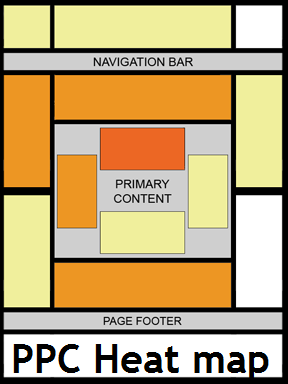
Google have kindly produced an image to help publishers understand where about adverts get clicked the most. The image to the right  illustrates that the best performing adverts are just above the primary content. After that, the next best performing adverts are (if there is one) in the left hand sidebar, below the navigation bar and above the page footer. As much as you should guide your adverts into these areas, the results will vary. This heat map is only an estimate and will not apply for everyone. For example, Ask Will Online has an advert to the right of the header (many other websites adopt this ad positioning too) and has proved to be very successful.
It is also important to note that ad size is strongly related to positioning. Different ad sizes in the same position will have varied results. From this, here are some ad sizes you should use in ad positions on a web page:
- Above Content – large/medium size adverts. The squarer the advert, the better.
- Below Content – Same as above ^^.
- Sidebar adverts – 160×600 or 120×600 adverts only. These are the most successful. If the sidebar is wide, you can think about using squarer adverts too.
- Header – 468×60 or 728×90 adverts only.
- Page footer or below navigation – Long horizontal Adsense links.
These are not rules you should use but merely guidlines if you are finding it difficult in gaining a high CTR.
The colour of adverts are an extremely important factor too (if you have just image adverts set, you won’t have to read this). Different colours have different meanings with them being (from ‘Colours of Adsense‘):
- Green – sign of nature, life and peace.
- Blue – colour of loyalty and the typical web link.
- Purple colour of wealth.
- Brown – men’s favourite colour.
- Yellow – colour of optimism.
- Red – colour of warning.
- White – colour of purity.
- Black – colour of dominance.
As you can see, every colour has a different meaning evoking a different reaction to your visitors. What you should try to do is base the colours around your audience. For example, if your audience is mainly male, use brown with your adverts. However, if your visitors are mostly ‘geeks’, you can use blue as the stereotypical link colour. It depends on who sees your advert what colour to choose.
You must be logged in to post a commentLogin