The last PPC campaign I analysed in the ‘Analyse A Real PPC Campaign’ series was from Loaf, who had a campaign that had slightly different targeting as opposed to its competitors – where the competitors of Loaf went for being price sensitive, Loaf removed any quantitative values and went for a luxurious brand name as their USP. With the prescription glasses market a competitive one both on the high street and online, it is the perfect sector to look into analysing a PPC campaign. Therefore, without further ado, here is a analysis of a PPC campaign from Perfect Glasses.
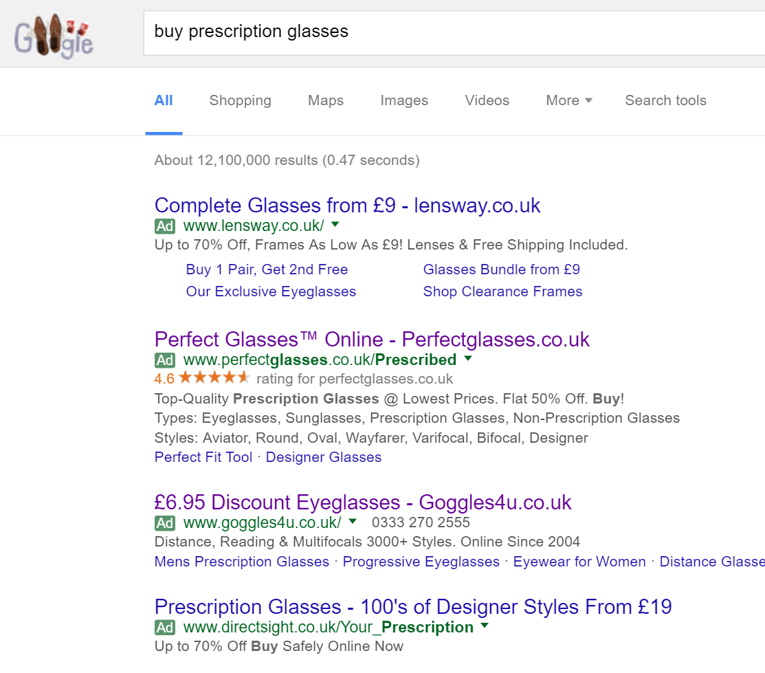
To view Perfect Glasses PPC search advert, I had to type into Google search UK, ‘buy prescription glasses’: Straight away, we can see the competition is maxed out filling all of the four available positions for paid search results. With Perfect Glasses not appearing organically on the first page of search engine results, we can understand exactly why they have chose to create a PPC campaign for such a keyword search phrase: to gain valuable potentially converting traffic that otherwise would have gone to their competitors.
Looking at the advert itself, it pretty much follows the ‘standard’ PPC search advert structure. Perfect Glasses have included both the brand name and URL in the title (very common for PPC search adverts to do this to induce more direct traffic and spread brand awareness). The description is packed with keywords relating to glasses which will help to target the whole market that are looking to buy prescription glasses (and not just a segment). The ratings extension is a good addition. However, I feel the site link extension has not been used to its full potential, both in terms of how many links to display and what to link to.
After clicking on the above advert, I came to the following landing page: The landing page is good but could be better. Here are the main areas it could possibly be improved:
- The navigation menu looks to be a menu that will expand the links the web user can click on upon hovering over each of the menu options. However, this is not the case – it would have been easier for web users to find the type of glasses they want from having a menu which expands its options upon hovering.
- The colour scheme of this landing page is not overly convincing. The orange of the logo is only used on four links with the yellow and red seemingly out of place. It would have been better if Perfect Glasses could have used the orange from the logo in a few more areas to blend the colour scheme better – at the moment, it seems to contrasting.
- However, contrasting landing pages are not always bad. The yellow/red area will definitely grab the web user’s attention, highlighting the fact there is a special discount code which runs out tonight. This will induce a panic from the web user to make a conversion with Perfect Glasses before the voucher code expires, which will be helped by using red which comes across as an ‘urgent’ colour.
You must be logged in to post a commentLogin